Cream Crackers Packaging Orange Diamond Classic
Topics
Details
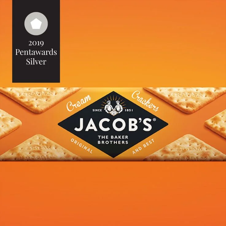
Vibrant orange saturates the frame, establishing a warm, energetic backdrop for the Jacob's Cream Crackers package. A dark charcoal diamond anchors the center, displaying the brand name in bold white sans-serif alongside 'The Baker Brothers' and the 1881 founding date. Square, golden-brown crackers with visible salt crystals and embossed text flank the logo at diagonal intervals, while a vertical black banner in the upper left corner announces the 2019 Pentawards Silver recognition beneath a gray pentagon icon.
The composition leverages geometric contrast effectively, pitting the sharp diamond emblem against the rectangular cracker forms and the rigid award plaque. Warm gradients across the orange field create subtle depth without distracting from the product photography, which renders the biscuit texture with convincing crispness. Typography balances historical weight with modern clarity, positioning the heritage claim directly above the contemporary packaging award to bridge tradition and current design excellence.
Brand strategists analyzing heritage food packaging would find this case study useful for understanding how established identities integrate contemporary accolades. Packaging students could examine the color psychology of appetite-stimulating orange paired with authoritative black elements. Marketing teams developing premium snack lines might reference the spatial arrangement when balancing product visibility with award credentials on limited shelf space.