Crispbreads Modern Yellow Green Blue Typography
Topics
Details
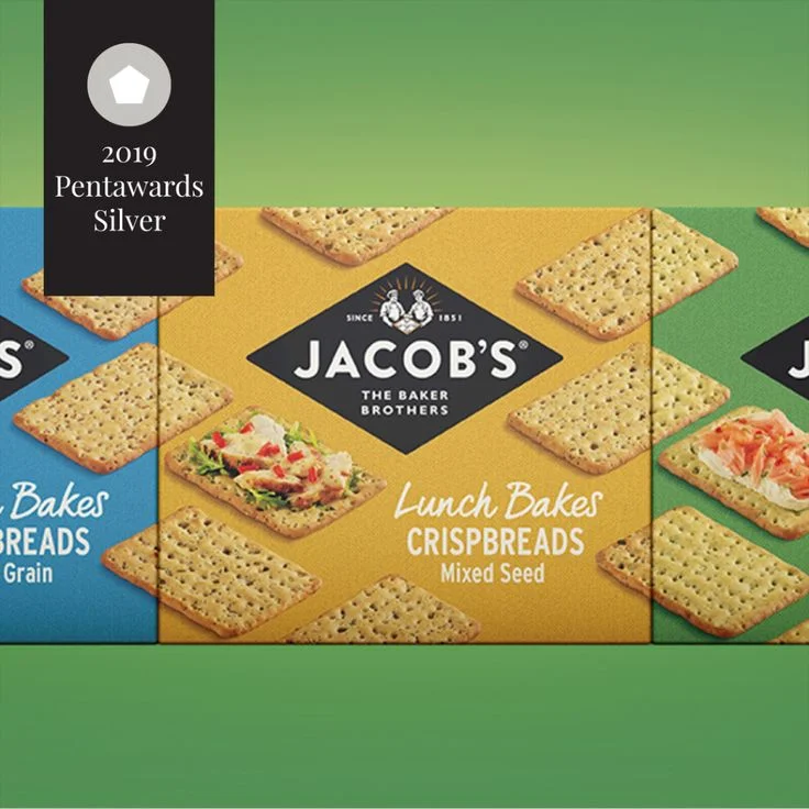
Three rectangular crispbread boxes sit side by side, each featuring a distinct background color—blue on the left, mustard yellow in the center, and forest green on the right. The central yellow package displays the Jacob's logo inside a black diamond shape with 'The Baker Brothers' text beneath it, while 'Lunch Bakes Crispbreads Mixed Seed' appears in cream-colored script and sans-serif fonts. Rectangular crackers with visible seed inclusions scatter across each surface alongside food photography showing topped cracker arrangements. A black vertical banner occupies the upper left corner containing a white pentagon icon above the text '2019 Pentawards Silver'.
Color blocking creates immediate visual separation between product variants while maintaining brand cohesion through consistent typography and the recurring diamond logo mark. The warm yellow tone of the central package draws primary focus, balanced by cool blue and green neighbors that suggest flavor variety without disrupting the unified grid layout. Food styling photographs integrate naturally into the pattern of bare crackers, demonstrating serving suggestions while reinforcing the textured, seeded appearance of the actual product.
Packaging designers studying award-winning consumer goods layouts will find this composition useful for analyzing how color psychology influences shelf presence and category differentiation. Brand identity teams can reference the typographic hierarchy between the established wordmark and descriptive subtext when developing their own snack-food visual systems. Marketing researchers evaluating Pentawards submissions might examine how the silver award badge integrates into the overall design without competing with core product information.