Cult Ice Cream Carton
Topics
Details
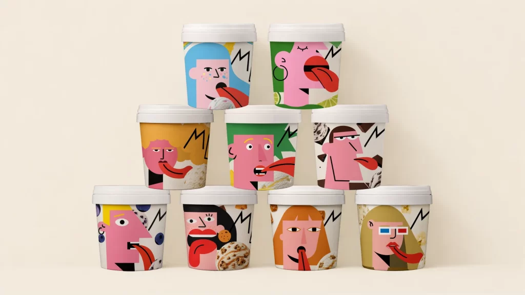
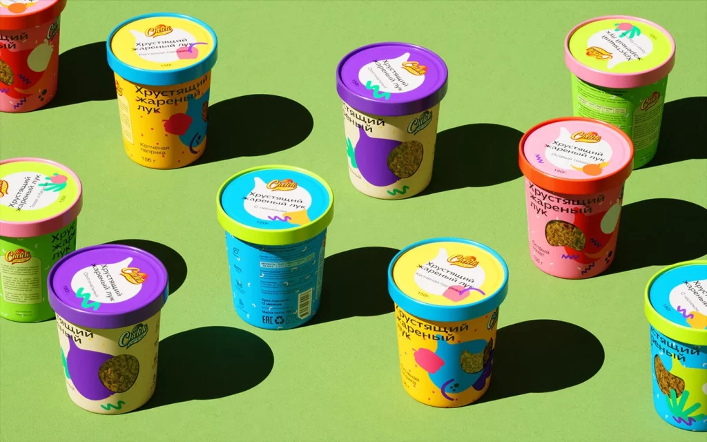
Vibrant cylindrical tubs of Cult ice cream scatter across a mint-green surface, each container crowned with a brightly colored lid in shades of yellow, purple, pink, green, or blue. Bold Cyrillic text reading 'Хрустящий жареный лук' (Crispy Fried Onion) and 'Сытный' (Hearty) wraps around the white bodies, accented by playful abstract graphics and transparent windows revealing the textured contents within. Sharp directional shadows stretch diagonally from each tub, suggesting bright overhead lighting that enhances the saturated, pop-art palette of the arrangement.
Visual interest stems from the deliberate clash between the playful, almost psychedelic graphic language and the savory, unconventional flavor profile suggested by the onion imagery. The design leverages a maximalist approach where every element competes for attention, from the wavy decorative lines to the mismatched lid-and-body color combinations that prevent any single unit from blending into the next. Such aggressive cheerfulness subverts typical dairy dessert conventions, positioning the product as an irreverent, conversation-starting novelty rather than a traditional sweet treat.
Brand strategists analyzing disruptive packaging trends would find this composition useful for studying how color theory applies to unexpected food categories. 3D environment artists requiring reference for product visualization could examine the material properties of the semi-matte cardboard and the specific way light interacts with the curved plastic lids. Marketing teams developing campaigns for Gen-Z audiences might study the typographic hierarchy and spatial arrangement to understand how whimsical aesthetics can make utilitarian containers feel like collectible objects.