Deli Dog Food Carne Illustration Black Tube
Topics
Details
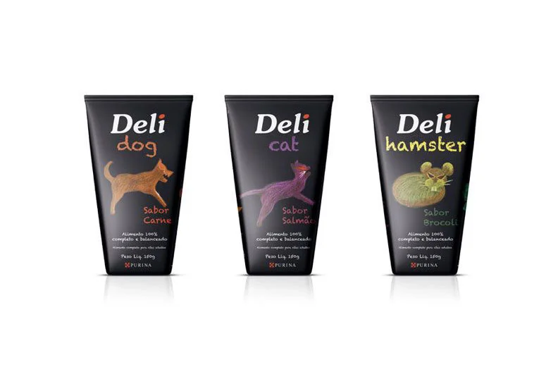
Three matte black squeeze tubes stand in a horizontal row, each featuring the brand name 'Deli' in bold white serif lettering above a species-specific identifier. The leftmost container displays 'dog' in orange lowercase script alongside a warm brown canine silhouette and the flavor text 'Sabor Carne' in red. A purple feline illustration marks the middle tube labeled 'cat', while the rightmost package shows 'hamster' in lime green with a rounded rodent graphic and 'Sabor Brocoli' in teal. Small white text at the base of each tube indicates 'Alimento 100% completo e balanceado' along with weight specifications and the Purina logo.
Visual hierarchy relies on color-coded typography that distinguishes each pet category while maintaining structural consistency across the product line. The hand-drawn animal illustrations introduce an organic, playful counterpoint to the industrial packaging geometry and dark substrate. Typography shifts between clean sans-serif for the brand mark and casual script for the animal designations, creating a layered reading experience that guides the eye from corporate identity to specific use case.
Brand strategists developing pet-care packaging systems could analyze how restricted palettes differentiate SKUs without abandoning unified identity. Illustrators studying character design for consumer goods might examine how simplified silhouettes convey species recognition at small scales. Packaging engineers evaluating squeeze-tube ergonomics could reference the proportions and label placement shown here when prototyping similar containers.