Ditop Cement Flexible Premium Super Red White
Topics
Details
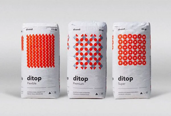
Three vertical white paper sacks stand in a row, each displaying the brand name 'ditop' in bold black lowercase letters above the product variants 'Flexible', 'Premium', and 'Super'. The packaging features distinct red geometric patterns: wavy vertical lines on the left bag, a grid of circles with diamond intersections in the center, and a lattice of four-petal floral motifs on the right. Small text at the top reads 'divendi' alongside a weight marking of '25 kg', while regulatory symbols and fine print appear near the bottom of each sack.
Visual differentiation between these three cement grades relies entirely on the contrasting red graphic motifs printed against the white substrate. Each pattern creates a unique texture and rhythm that allows for instant identification from a distance, turning industrial commodity packaging into a cohesive yet varied design system. The consistent typographic hierarchy anchors the collection while the varying ornamentation provides clear product segmentation without altering the fundamental package structure.
Industrial designers studying bulk material packaging can examine how color-coded patterns communicate product tiers within a unified brand family. Packaging engineers might reference this layout when developing visual systems for construction materials that require quick shelf recognition. Brand strategists could also analyze how minimal graphic elements effectively distinguish flexible, premium, and super grades without cluttering the essential technical information.