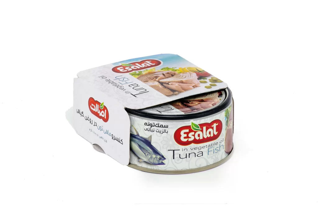
Esalat Tuna Can Packaging
DownloadTopics
Details
A cylindrical metal tin of Esalat brand tuna sits at a three-quarter angle, partially wrapped by a white cardboard sleeve that drapes over the top edge. The can's body displays a silver base with a decorative white pattern, featuring a realistic illustration of a bluefin tuna alongside the red 'Esalat' logo with its green leaf accent. Bold black typography identifies the contents as 'Tuna Fish in vegetable oil,' while Arabic script mirrors this information on both the sleeve and the main label, all illuminated by soft, even studio lighting that eliminates harsh shadows.
The packaging distinguishes itself through the strategic use of bilingual text and the partial sleeve design, which creates a layered, dimensional appearance rather than a flat label application. Color plays a significant role here, as the vibrant red of the brand logo contrasts sharply against the cool metallic tones of the container and the crisp white of the outer wrap. Designers examining this reference will note how the photographic food imagery on the sleeve's top flap adds appetizing texture without cluttering the primary branding area. The full-resolution asset is provided at no cost for detailed inspection of these typographic and material interactions.
Product photographers and packaging engineers might utilize this specific angle to study how light reflects off curved metal surfaces versus matte paper materials. 3D artists requiring accurate texturing references for canned goods will find the subtle embossing on the metal rim and the specific print quality of the cardboard particularly useful. Marketing teams analyzing Middle Eastern market packaging trends could also benefit from comparing the English and Arabic typographic hierarchies present on this specimen.