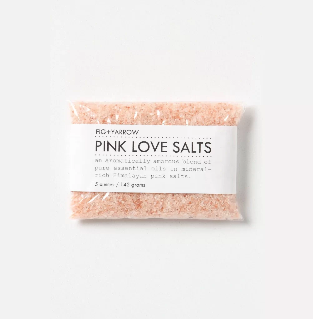
Fig Yarrow Pink Love Salts Packaging
Topics
Details
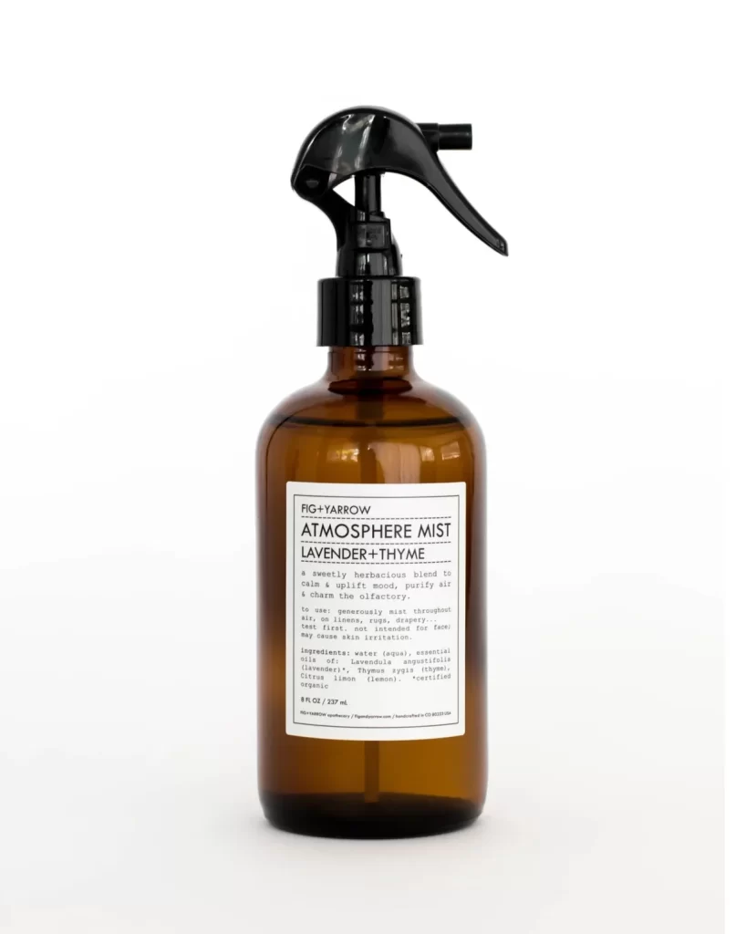
A clear plastic pouch filled with coarse, pale pink Himalayan salt crystals sits centered in the frame, wrapped with a crisp white paper label bearing the brand name FIG+YARROW above the bold, sans-serif product title PINK LOVE SALTS. The label's typography mixes a large, all-caps headline with smaller descriptive text detailing an aromatically amorous blend of pure essential oils and mineral-rich salts, alongside the weight specification of 5 ounces or 142 grams. Soft, even lighting illuminates the translucent granules and the matte paper surface against a clean, light-toned backdrop, while the camera maintains a straight-on perspective that emphasizes the rectangular form of the package.
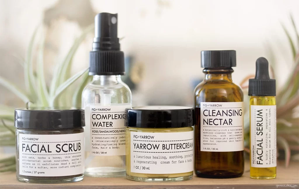
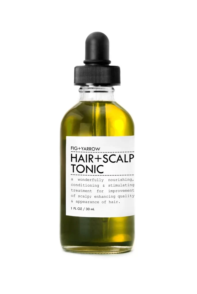
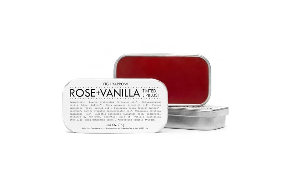
Visual distinction emerges from the restrained color palette that lets the natural rose hue of the salt crystals provide the only warmth against the clinical white label and neutral background. The typographic hierarchy creates immediate legibility through generous spacing between the brand identifier, the prominent product name, and the delicate dotted line separator that organizes the information without clutter. Minimalist material choices—uncoated paper, transparent film, and unrefined salt—communicate an artisanal, organic sensibility that feels both luxurious and grounded.
Brand strategists developing wellness or beauty product lines could study this composition to understand how limited color palettes and ample negative space convey purity and premium positioning. Packaging designers tasked with creating labels for bath products or gourmet foods might reference the balance between bold display type and understated body copy to achieve similar shelf presence. Art directors planning e-commerce photography for small-batch goods could adapt the lighting approach and framing to highlight texture while maintaining a sophisticated, editorial aesthetic across their visual catalogs.