Floki Beer Packaging C
Topics
Details
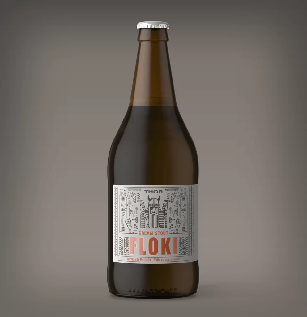
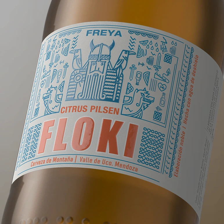
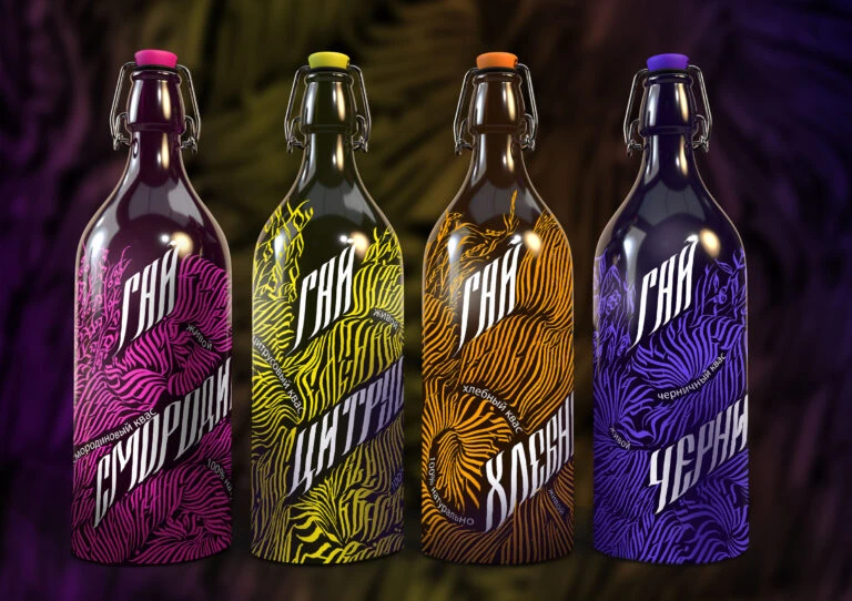
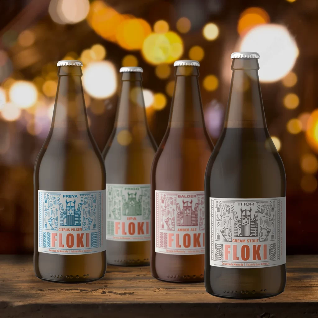
Four brown glass bottles stand in a staggered row on a weathered wooden surface, each sealed with a silver crown cap and bearing a distinct label from the Floki brand. The labels feature intricate line-art illustrations of Norse-inspired figures—Freyja, Frigg, Balder, and Thor—rendered in cyan, mint green, coral red, and black respectively against white backgrounds. Warm bokeh lights in amber and cream tones blur into the background, creating a shallow depth of field that emphasizes the packaging while the camera maintains a straight-on perspective slightly below eye level.
Visual cohesion emerges through the consistent typographic hierarchy across all variants, with 'FLOKI' dominating each label in bold sans-serif lettering while the deity names and beer styles occupy secondary positions. The illustrative style employs dense geometric patterning and symmetrical iconography that evokes Scandinavian folk art without resorting to clichéd viking imagery. Color coding functions as an intuitive sorting mechanism, allowing immediate differentiation between the Citrus Pilsen, IPA, Amber Ale, and Cream Stout varieties through hue alone.
Brand strategists developing product-line extensions would benefit from studying how this system maintains recognizability while accommodating diverse flavor profiles. Packaging designers tasked with creating craft-beer identities could analyze the balance between ornate illustration and legible typography for retail shelf impact. Art directors overseeing beverage photography might reference the lighting setup and surface texture choices to achieve similar atmospheric warmth in their own studio compositions.