Title

Fudge Packaging Blue Illustration Whimsical Design


Topics

No Topics

Details

Uploaded user: Leo

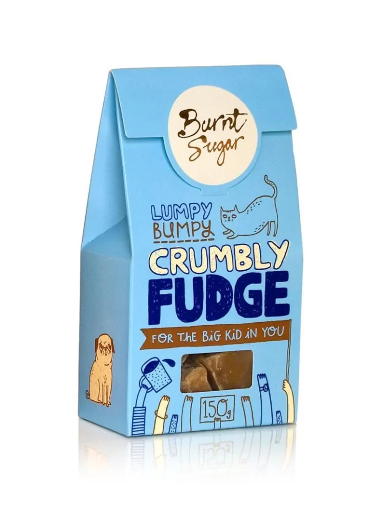
A light blue cardboard carton with a gable-top closure stands at a three-quarter angle, revealing its left side panel and front face. The packaging features a cream-colored circular label at the top bearing the brand name 'Burnt Sugar' in a dark brown script font. Below this, the product name appears in mixed typography: 'LUMPY BUMPY' in blue and brown hand-drawn letters, followed by 'CRUMBLY FUDGE' in large navy block letters with a cream fill, all positioned above a brown banner reading 'FOR THE BIG KID IN YOU'. A rectangular transparent window near the bottom exposes the actual fudge pieces inside, while the weight '150g' sits in a small box outline beneath the window.

Playful line-art illustrations define the visual character of this package, including a grumpy pug on the left panel, an elongated blue cat above the main text, and cartoon arms holding objects like a mug at the base. The color palette restricts itself to sky blue, navy, cream, tan, and chocolate brown, creating a cohesive yet lighthearted aesthetic that contrasts the sophisticated gable-box structure with childlike doodle-style graphics. Typography varies significantly across the surface, switching between casual handwritten scripts, bold sans-serifs, and outlined display fonts to establish a clear hierarchy between brand identity and product description.


Packaging designers studying confectionery branding might examine how the illustration style balances adult appeal with nostalgic whimsy through specific character choices and color saturation levels. Art directors developing artisanal food products could reference the way transparent windows integrate with surrounding graphic elements without disrupting the overall composition. Students of typography might analyze how varying font weights and styles within a single wordmark create visual rhythm while maintaining legibility on a curved or folded substrate.