Full Moon Dog Treats Chicken Turkey Jerky Green White Stars
Topics
Details
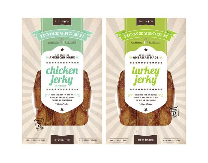
Two vertical pet treat packages stand side by side, each featuring a central white shield-shaped label with teal or lime green script typography reading "chicken jerky" and "turkey jerky" respectively. The packaging employs a cream-colored radial sunburst background pattern, topped with a dark charcoal banner bearing the brand name "FULL MOON" in small caps. Below this, a curved ribbon graphic in either soft sage or bright grass green displays the word "HOMEGROWN" flanked by a bone icon, while the lower portion reveals realistic photographic textures of dried meat strips visible through clear window panels.
Visual distinction emerges from the deliberate color-coding strategy that differentiates the poultry varieties while maintaining strict typographic hierarchy across both variants. The shield motif creates a badge-like authenticity, reinforced by decorative star dividers and a handwritten signature at the label's base that suggests artisanal craftsmanship rather than mass production. Subtle details like the circular "U.S.A." stamp and net weight indicators ground the design in practical retail requirements without disrupting the vintage Americana aesthetic.
Brand managers developing natural pet food lines could study the color psychology applied here to distinguish product SKUs within a unified family. Packaging engineers might reference the structural balance between transparent product visibility and opaque branding zones when designing stand-up pouches for premium snack categories. Marketing teams launching farm-to-table animal nutrition products could adapt this visual language to communicate transparency and domestic sourcing claims effectively across digital and physical touchpoints.