Future Wise Moisturizing Mist Barrier Cream Moisturizer Balm
Topics
Details
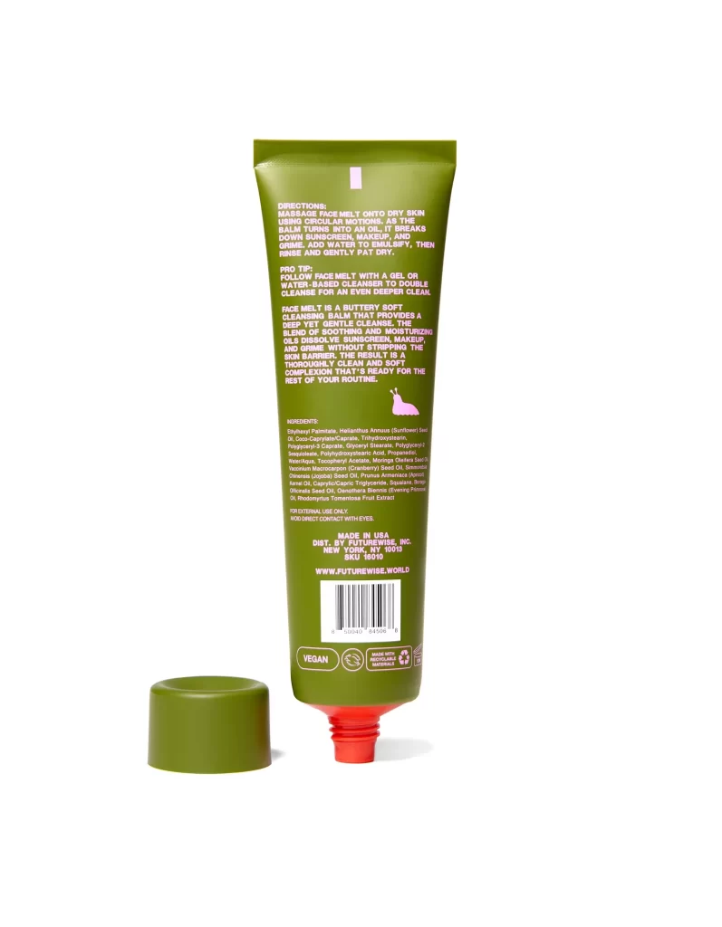
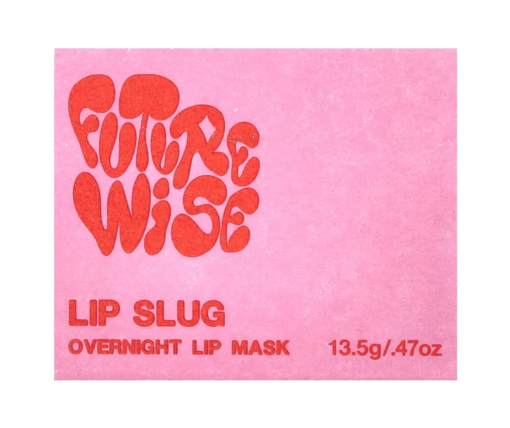
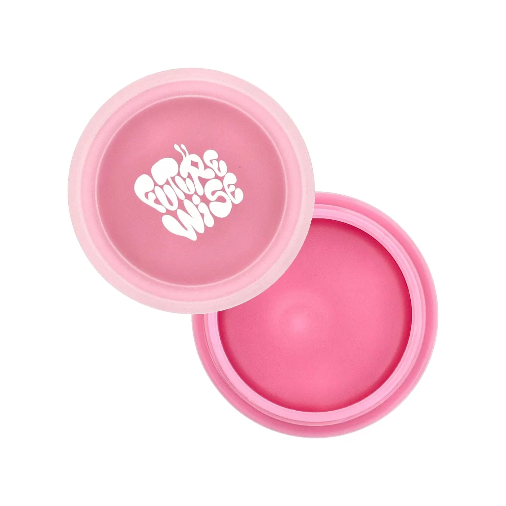
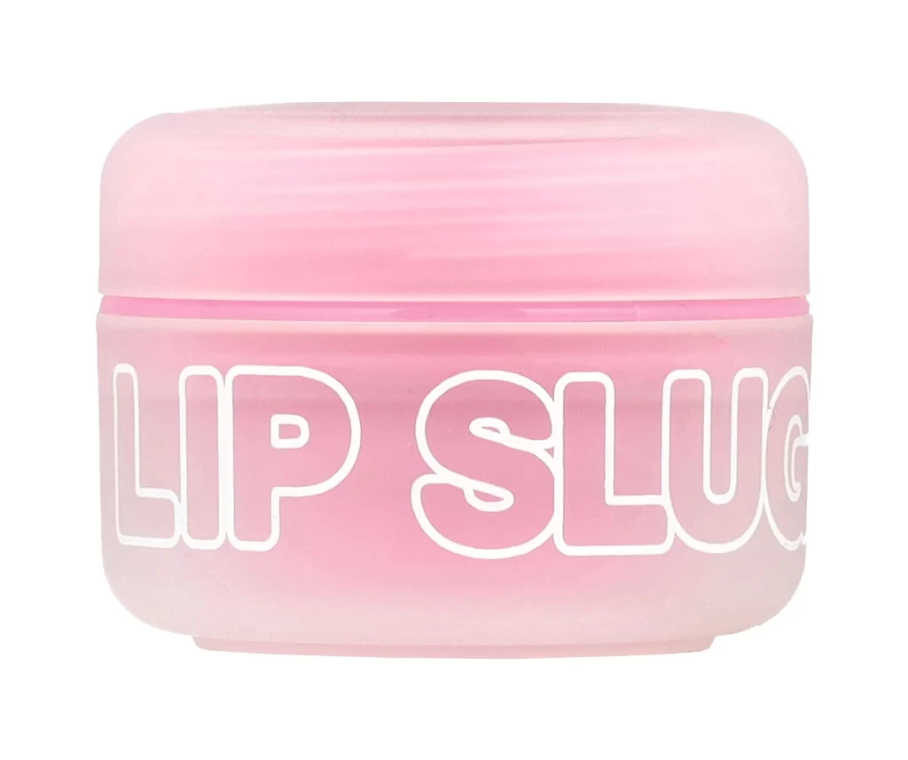
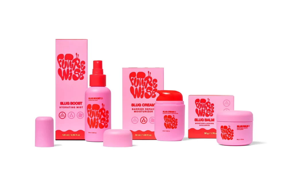
Arranged in a clean horizontal line against a seamless white backdrop, this skincare collection presents a striking study in monochromatic pink and crimson. Each vessel—from the cylindrical spray bottle to the squat jars—features a matte, rubberized finish that absorbs light softly, while the accompanying cardboard boxes display a glossy, saturated red logo spelling out 'Future Wise' in bubbly, organic typography. The composition balances standing products with detached caps placed deliberately in the foreground, all captured from a straight-on camera angle that emphasizes the graphic symmetry of the packaging design.
Visual cohesion emerges from the deliberate repetition of that distinctive, almost liquid-like brand mark across every surface, creating an immediate sense of product family identity. The choice of soft pastel pink for the containers against the aggressive, high-contrast red lettering generates a playful yet sophisticated tension that feels both youthful and premium. Furthermore, the consistent use of circular iconography—representing hydration and barrier protection—adds a layer of semiotic clarity that complements the bold typographic treatment without competing for attention.
Brand strategists examining cohesive identity systems across multiple SKUs will find valuable lessons in how color and form language maintain consistency while differentiating product types. Packaging designers tasked with creating shelf presence through minimal color palettes can study how the interplay between matte textures and glossy print elements creates tactile visual interest. Meanwhile, art directors planning e-commerce photography layouts might reference the spatial arrangement and prop styling techniques used here to showcase complete product ranges effectively.