Gummies Packaging Colorful Cartoon Characters Child-Friendly Design
DownloadTopics
Details
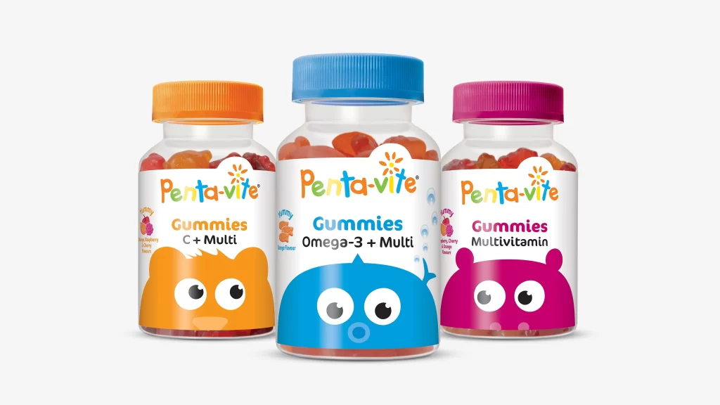
Three transparent plastic bottles of Pentavite Gummies stand in a row, each topped with a screw cap in orange, blue, or magenta. The labels feature the brand name in multicolored lowercase letters above product names like C+ Multi, Omega-3 + Multi, and Multivitamin. Below the text, cartoon animal faces with large round eyes occupy the lower half of each label: an orange bear on the left, a blue whale in the center, and a magenta creature on the right. Soft studio lighting illuminates the scene from the front, casting subtle shadows beneath the containers against a light gray backdrop.
The packaging relies on bold primary and secondary colors combined with simplified character illustrations to signal child-friendly appeal immediately. Each bottle uses a distinct hue for both its cap and mascot face, creating clear visual differentiation between the three supplement varieties while maintaining brand cohesion through consistent typography and layout structure. Designers studying this composition can note how rounded shapes and expressive eyes soften the medical nature of vitamin supplements into an approachable format.
Product photographers might reference this arrangement when planning similar supplement lineups that require personality-driven labeling strategies. Brand identity teams developing children's health products could analyze how color coding helps consumers distinguish between formulas at a glance. Anyone needing detailed visuals of these specific Pentavite packages can access the full-resolution file without cost directly from the resource page.