Hair Repair Oil Brown White Simple Clean Design
Topics
Details
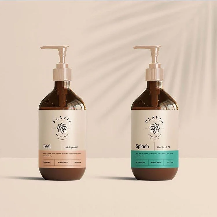
Two amber glass bottles with white pump dispensers stand side by side, each bearing a cream-colored label for FLAVIA BOTANICALS. The left bottle displays the word "Feel" above a terracotta-colored band, while the right reads "Splash" over a teal strip, both identifying the product as Hair Repair Oil with smaller text detailing benefits like "Taming Frizz" and "Extreme Repair." Soft diagonal shadows from window blinds fall across a pale beige backdrop, and the camera captures the scene from a straight-on, eye-level perspective that emphasizes the symmetrical arrangement.
Minimalist typography and a restrained color palette define this packaging concept, where the botanical line-art logo anchors the upper label area without competing with the product names. The contrast between the dark glass and the light labels creates visual hierarchy, while the distinct accent colors at the bottom of each variant allow for immediate differentiation within a cohesive brand family. Such restraint in ornamentation directs focus entirely to the text hierarchy and material quality of the containers themselves.
Brand identity designers studying premium cosmetic packaging would examine this composition to understand how subtle color coding supports product line extension without fragmenting visual unity. Art directors planning e-commerce photography could reference the lighting setup and shadow placement to achieve similar depth in their own product presentations. Packaging engineers might also note the pump mechanism integration and label proportions when developing new hair care formulations requiring elegant dispensing solutions.