Hamster Food PUUR Natural Ingredients White Yellow Red Illustration
Topics
Details
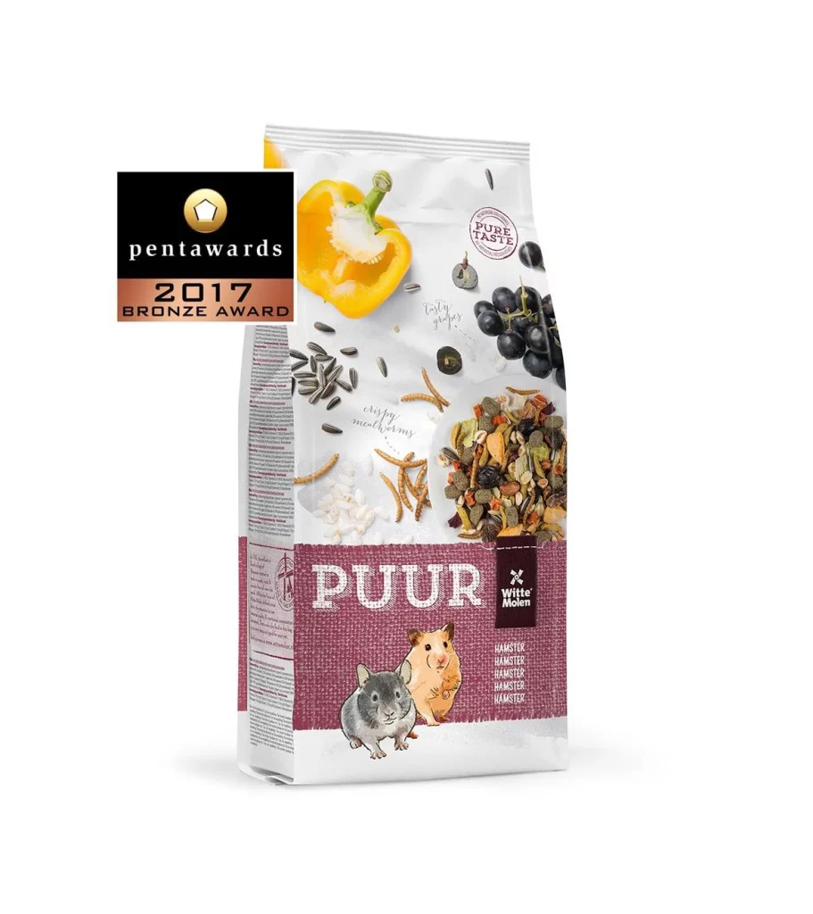
A freestanding bag of PUUR hamster food stands at a slight three-quarter angle, revealing both its front panel and left side seam. The packaging features a deep burgundy lower band with the brand name in large white serif lettering, topped by a photographic spread of yellow bell pepper halves, dark grapes, sunflower seeds, and mixed grains scattered across a clean white surface. Two illustrated hamsters—one gray, one golden—sit near the bottom, while the Witte Molen logo appears in a small black tag on the right edge.
The design distinguishes itself through the juxtaposition of realistic ingredient photography against whimsical animal illustrations, creating an approachable yet premium aesthetic for pet nutrition products. A circular 'Pure Taste' stamp floats among the produce imagery, while the 2017 Pentawards Bronze Award badge in the upper left corner signals industry recognition without overwhelming the primary visual narrative. The textured appearance of the burgundy section suggests burlap or woven fabric, adding tactile depth to the otherwise glossy printed surface.
Packaging designers studying award-winning pet food branding would find this composition valuable for analyzing how photography and illustration coexist within retail product layouts. Marketing teams developing natural or organic animal care lines could reference the color palette and typographic hierarchy when conceptualizing their own shelf presence. Art directors working on e-commerce photography might study the lighting balance between matte illustrated elements and reflective plastic packaging surfaces to achieve similar visual clarity in their own product shoots.