Harmonyos Logo Interface
Topics
Details
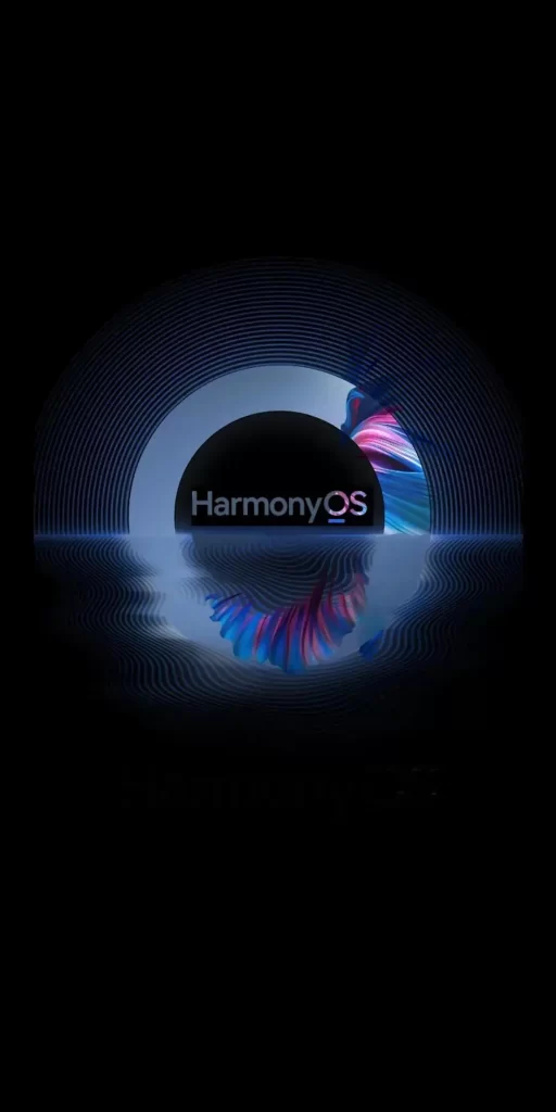
A deep black void frames the central composition, where a solid matte black circle anchors the word "HarmonyOS" in crisp white sans-serif lettering. Concentric blue-white rings radiate outward from this core like ripples in water, while a vibrant ribbon of magenta and cyan swirls dynamically around the right edge. The entire assembly hovers above a reflective surface that mirrors the circular forms and colorful accents with subtle distortion.
Visual tension arises from the contrast between the rigid geometric precision of the concentric arcs and the organic fluidity of the multicolored swirl. The interplay of light and shadow across the glossy reflection adds dimensional depth that transforms flat graphic elements into something almost sculptural. Cool blue tones dominate the palette while the hot pink accent provides an energetic focal point that draws the eye through the composition.
Motion designers might study the wave patterns to understand how to animate liquid interfaces with similar elegance. Brand strategists could analyze how the color balance between corporate blues and vibrant accents communicates technological sophistication. Interface architects may reference the spatial relationship between text placement and surrounding graphical elements when constructing their own logo lockups.