Home Chef Meal Kit Fresh Ingredients Packaging
Topics
Details
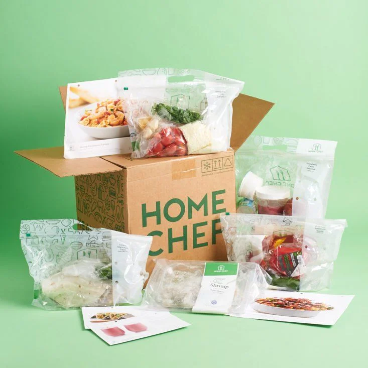
A corrugated cardboard shipping container bearing the bold green 'HOME CHEF' logotype anchors the composition, its flaps splayed open to reveal a curated assortment of vacuum-sealed ingredient pouches and recipe cards. The packaging materials range from translucent polyethylene bags printed with faint line-art icons to a white label clearly identifying 'Shrimp,' all arranged in a loose radial formation around the central box. Soft, diffused studio lighting eliminates harsh shadows across the mint-green backdrop, while the camera maintains a straight-on perspective that emphasizes the dimensional depth of the stacked components.
Visual interest derives from the deliberate contrast between raw industrial cardboard textures and the clinical clarity of the food-safe plastics, creating a tactile hierarchy that guides the eye from brand identity to product contents. The typographic treatment of the primary logo employs a heavy sans-serif weight that commands attention without overwhelming the delicate photographic imagery on the recipe cards tucked into the arrangement. Subtle branding elements, including the house-shaped icon on the upper bags, demonstrate how secondary graphics can reinforce corporate identity across disparate material surfaces.
Packaging engineers might analyze this arrangement to study how meal-kit services balance structural integrity with unboxing aesthetics, particularly regarding the visibility of perishable contents through transparent films. E-commerce photographers could reference the lighting ratios and color palette to replicate this clean, appetizing aesthetic for their own subscription-box campaigns. Brand strategists examining the image would note the strategic placement of recipe cards as both functional tools and visual anchors that humanize the otherwise utilitarian shipping materials.