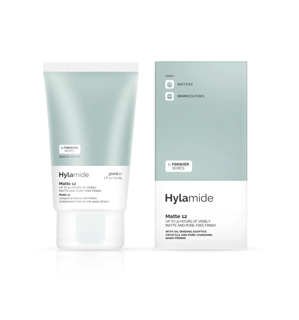
Hylamide Matte Finisher Series Minimalist Green White Packaging Design
Topics
Details
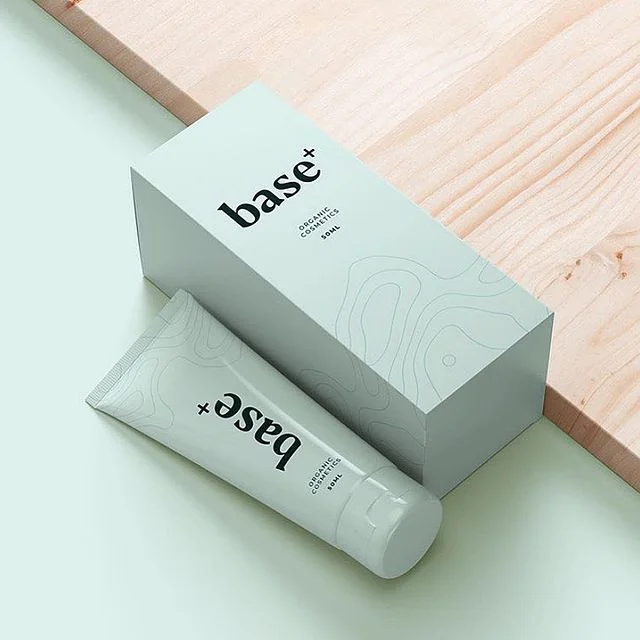
A soft sage-green tube and matching rectangular carton sit side-by-side, both featuring crisp white lower panels that anchor the typography. The tube displays 'Hylamide Matte 12' in bold black sans-serif beneath a small 'FINISHER SERIES' badge, while the box expands on benefits like oil-binding crystals and pore-vanishing nano-prisms. Soft studio lighting creates gentle gradients across the matte surfaces, with a subtle reflection grounding the objects against an off-white backdrop.
Visual hierarchy relies on the stark division between the muted green upper zones and the high-contrast white text areas, creating immediate legibility without decorative clutter. Iconography remains functional—two simple outlined symbols communicate mattifying and pore-minimizing actions above the product name. The restrained palette and geometric precision signal clinical efficacy, aligning the aesthetic with the formulation's technical claims about adaptive crystals.
Brand strategists analyzing skincare packaging trends would examine how color psychology reinforces the matte-finish promise through desaturated tones. Packaging engineers could reference the structural balance between squeezable tube geometry and rigid box stability for retail display optimization. Art directors developing minimalist beauty campaigns might study the typographic weight distribution to understand how scientific terminology integrates with consumer-friendly claims.