Ice Cream Packaging Yellow Stripes Modern Clean Typography
Topics
Details
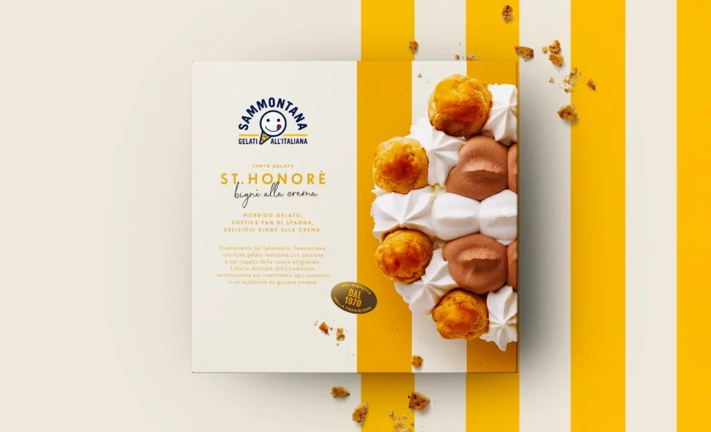
A rectangular Sammontana gelato box for St. Honoré cake sits at a slight angle, split between a cream-white left panel and a vibrant golden-yellow right panel decorated with vertical stripes. The packaging features the brand's circular blue logo with a smiling face icon above elegant gold and black typography describing the mousse-gelato, sponge cake, and cream layers. To the right, a photographic inset displays golden choux puffs, piped white cream dollops, and smooth chocolate mousse hearts, while scattered crumbs add texture across the yellow-striped surface beneath.
Bold vertical yellow bands create immediate visual rhythm against the minimalist white field, establishing a contemporary aesthetic that balances playfulness with sophistication. The typographic hierarchy skillfully contrasts the authoritative sans-serif brand mark with flowing script for the product name, while the realistic food photography provides tactile appeal through visible textures of crisp pastry and soft cream. This composition successfully merges traditional Italian confectionery heritage with modern graphic sensibilities through its restrained yet energetic color blocking.
Brand strategists developing premium frozen dessert lines could study this layout to understand how geometric color division guides consumer attention between branding and appetite appeal. Packaging designers working on artisanal food products might reference the integration of realistic imagery with abstract patterns to achieve both authenticity and visual impact. Marketing teams launching seasonal bakery items could adapt this striped motif and typographic layering approach for their own retail presentations.