Isle of Dogs Dog Treats Blueberry Natural Mini-Size Brown Blue
Topics
Details
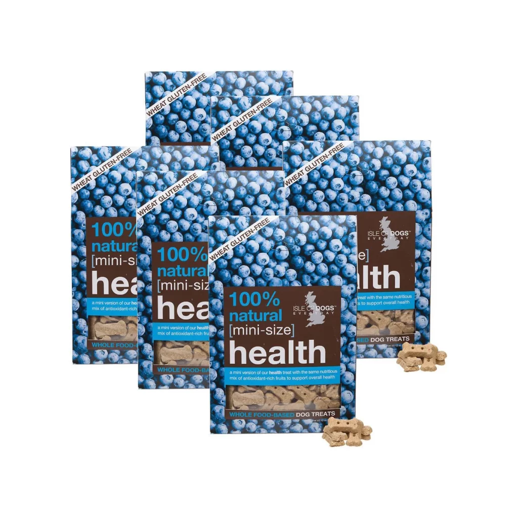
Six rectangular packages of Isle of Dogs Everyday dog treats are arranged in a staggered formation, each featuring a dense photographic pattern of blueberries in varying shades of cobalt and indigo. The front of each bag displays a dark brown label with bold white and cyan typography reading '100% natural [mini-size] health,' while a diagonal white banner across the upper portion declares the product 'WHEAT GLUTEN-FREE.' Several bone-shaped, tan-colored biscuits rest at the base of the composition, their matte texture contrasting with the glossy printed surfaces above them.
The visual identity relies on a striking juxtaposition between the organic, cool-toned fruit imagery and the earthy brown informational panels that ground the design. Repeating the blueberry motif across every package creates a cohesive brand presence that immediately communicates flavor and ingredient quality without requiring additional illustration. This particular mini-size variant emphasizes portability through its compact proportions, making the text hierarchy and color blocking especially critical for quick shelf recognition.
Packaging designers studying pet food branding would find this arrangement useful for analyzing how photography integrates with typographic systems on flexible substrates. E-commerce photographers could reference the lighting setup to understand how to render both translucent berry textures and opaque paper materials within a single frame. Marketing teams developing health-conscious product lines might examine how the wheat-free claim is positioned to catch the eye during casual browsing.