Japanese Okayama Lifestyle Family Ad
Topics
Details
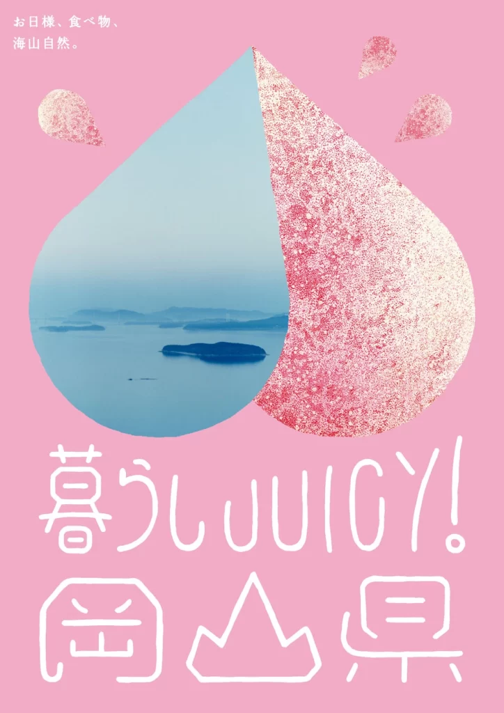
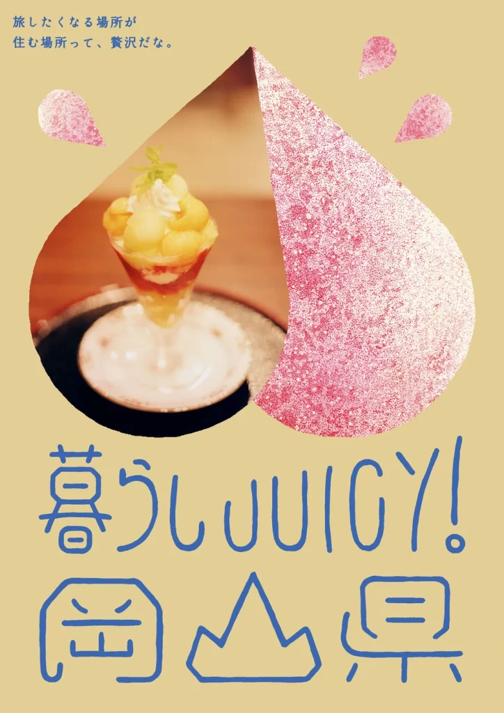
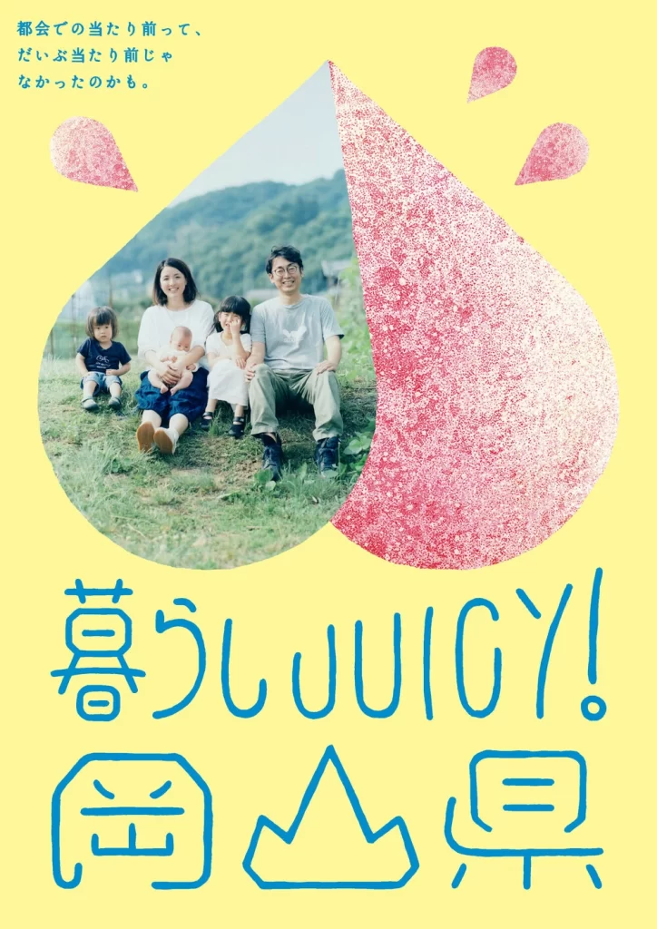
This image presents a graphic design piece set against a solid, vibrant yellow background. The composition is anchored by a large, teardrop-shaped form that dominates the center, which transitions from a photographic image on the left to a textured pink area on the right. Additional text elements in a matching blue hue are positioned in the upper left and lower sections of the frame.
The central teardrop shape features a distinct split design: the left side contains a realistic photograph of a family sitting on grass with green hills behind them, while the right side is filled with a dense, granular pink texture resembling sugar or fine glitter. Surrounding this main element are three smaller, outlined teardrop shapes in light blue that float near the top right. The typography consists of hand-drawn style Japanese characters and English text, contributing to an informal and organic visual flow.
The combination of bright primary colors and soft textures creates a cheerful and lighthearted atmosphere suitable for casual or family-oriented contexts. This type of layout is commonly utilized for regional tourism posters, event flyers, or decorative digital wallpapers where a sense of warmth and approachability is desired. The inclusion of specific geographic text suggests it serves as promotional material for a particular location.