JIELLES Royal Drop Box
Topics
Details
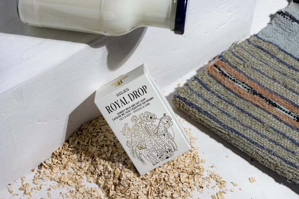
Over a scattered bed of pale, flaky oats, the white rectangular carton rests at an angle against a white painted surface, its surface catching bright, directional light that casts soft shadows to the left. The packaging displays 'JIELLES' in small capitals above the bold serif text 'ROYAL DROP', with smaller lines below indicating donkey milk and oat soap contents. Behind the box, a white glass bottle with a dark blue rim lies horizontally, while to the right, a woven textile with horizontal stripes of slate blue, rust, and cream adds textural contrast.
Line art illustration dominates the lower half of the carton, depicting an ornate figure on horseback surrounded by botanical motifs and birds, all rendered in fine black ink without color fill. This monochromatic approach creates visual tension against the raw organic material spilled beneath it, while the mix of serif typography and hand-drawn imagery suggests artisanal positioning. The overall composition balances clinical white space with rustic textures, making the packaging feel both premium and grounded in natural ingredients.
Product photographers studying natural prop arrangements would examine how the oats create an informal base that anchors the primary subject without obscuring key text. Packaging designers could reference the interplay between illustrative elements and typographic hierarchy when developing cosmetic or food-related branding systems. Art directors planning lifestyle shoots might note the effectiveness of combining hard surfaces with soft textiles to build layered, tactile environments.