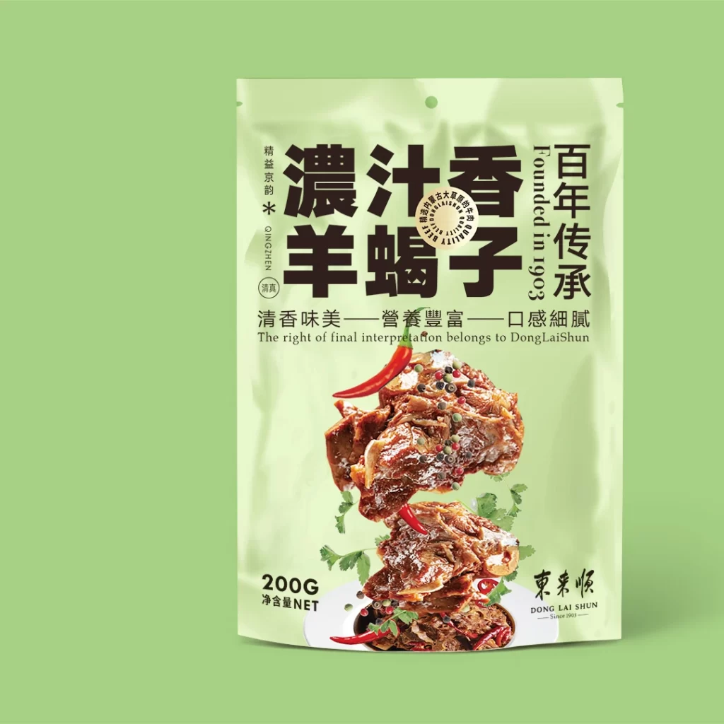
Jingyi Jingyun Braised Lamb Shank Pouch
Topics
Details
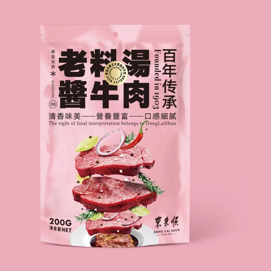
Set against a solid, muted sage-green backdrop, a translucent pale-yellow pouch stands as the central focus of the composition. The packaging features bold, black Chinese characters for 'Concentrated Juice Fragrant Lamb Shank' alongside vertical English text stating 'Founded in 1903'. A realistic photographic stack of glistening, reddish-brown braised meat, garnished with bright red chili peppers and fresh green cilantro leaves, dominates the lower half of the bag. The camera maintains a straight-on perspective with soft, even lighting that highlights the glossy texture of the food and the matte finish of the plastic material.
Visual interest is generated through the striking contrast between the minimalist, almost pastel background and the rich, appetizing colors of the culinary photography. The typography employs a dynamic mix of massive, heavy-weighted headlines and delicate vertical subtexts, creating a clear hierarchy that guides the eye from the brand heritage to the product name. Furthermore, the use of a semi-transparent material for the pouch allows the food imagery to feel integrated into the structure of the package rather than just printed on its surface.
Food photographers and packaging designers might study this layout to understand how to balance traditional cultural elements with modern appetizing visuals. Marketing teams working on premium snack lines could utilize this as a benchmark for positioning heritage brands in a contemporary market. Additionally, illustrators looking to practice rendering different textures—such as the sheen of sauce on meat versus the dullness of plastic film—will find a wealth of detail in this specific arrangement.