Jiuzhen Black Bean Sauce
Topics
Details
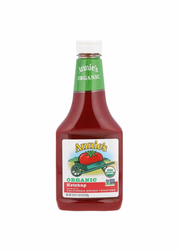
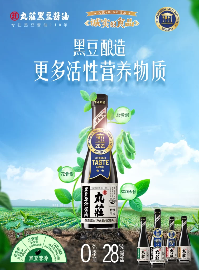
Compact travel setups are not the focus of this poster, which instead features a bottle of Jiuzhen black bean soy sauce centered against a bright blue sky and green field backdrop. Chinese characters dominate the layout, including the brand name ‘丸莊’ and claims about active nutrients like isoflavones, anthocyanins, and SOD. Multiple award badges appear at the top and on the bottle label, noting a 2006 Japanese certification and a 2021 Superior Taste Award from Brussels.
Visual hierarchy relies on large white typography for the main headline contrasting with the deep blue background, while green circular callouts highlight specific nutritional benefits around the product. The composition uses natural lighting photography to emphasize freshness, complemented by illustrated plant elements that frame the central bottle. A color palette of sky blue, leafy greens, and dark browns reinforces the organic, health-focused positioning of the brand.
Advertising professionals examine such layouts to understand how premium food brands balance technical certifications with lifestyle imagery in Asian markets. Packaging designers reference the integration of multiple award seals without cluttering the primary visual focus. Marketing students analyze the translation of ingredient benefits into visual selling points for functional condiments.