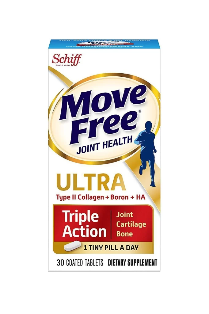
Joint Health Supplement White Gold Red Minimalist Design
Topics
Details
A rectangular supplement box stands upright, featuring a white base accented by gold and red graphic elements. The Schiff logo appears in burgundy at the top left, while the central oval badge displays 'Move Free' in bold navy blue serif lettering surrounded by a metallic gold ring. Below this, the word 'ULTRA' is rendered in large gold sans-serif type above a deep crimson banner containing white text that reads 'Triple Action' alongside benefits for joint, cartilage, and bone health.
The visual hierarchy relies on a restrained palette of navy, gold, and crimson against clean negative space to establish premium positioning. A dynamic blue runner silhouette breaks the geometric rigidity of the layout, adding movement to an otherwise structured composition. The pill icon and dosage instruction occupy the lower third within a subtle gold band, balancing the heavy typography above without cluttering the overall minimalist aesthetic.
Brand managers developing nutraceutical packaging can study how limited color palettes convey efficacy while maintaining shelf presence. Packaging designers might reference the typographic weight distribution between the brand name and product variant when creating their own supplement labels. Marketing teams analyzing competitive positioning could examine how the triple-action benefit callout integrates with the primary brand mark without overwhelming it.