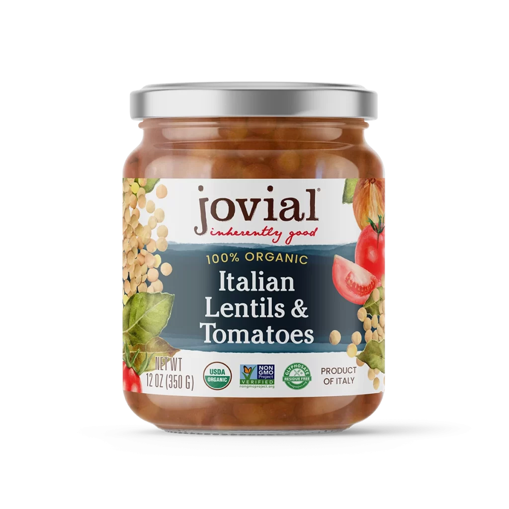
Jovial Organic Italian Lentils And Tomatoes Packaging 01
Topics
Details
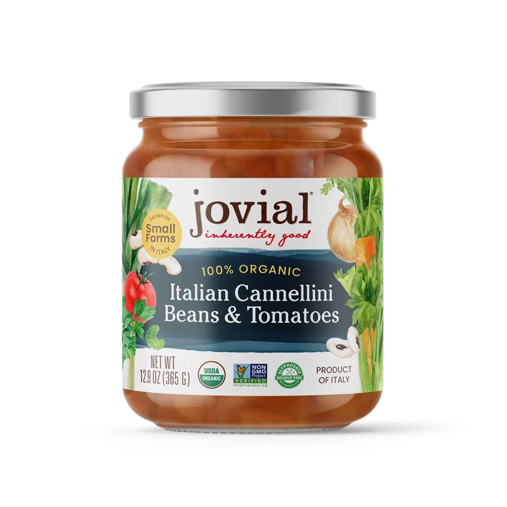
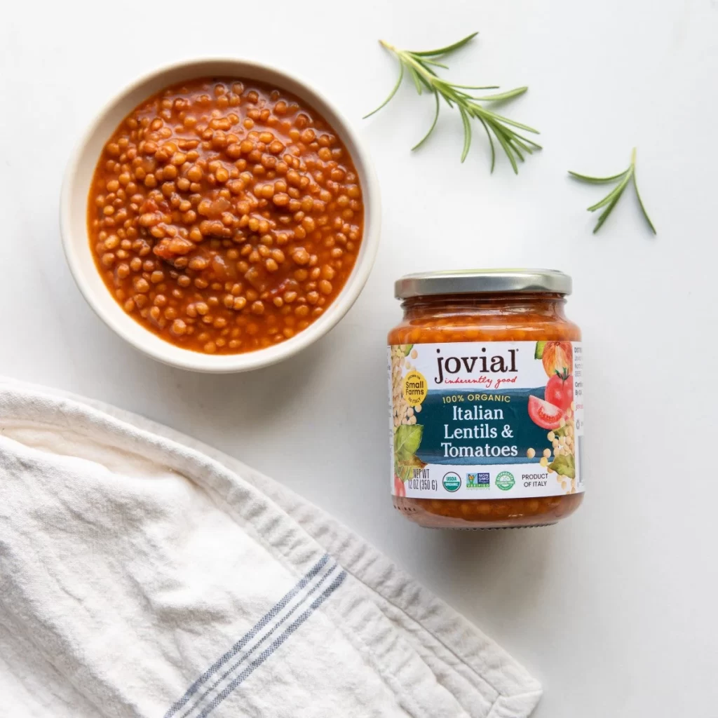
A glass jar filled with a rich, reddish-brown lentil mixture stands as the focal point on a white surface, capped by a reflective silver metal lid. The label features a clean white background with a dark navy blue band across the middle, where the brand name 'jovial' appears in a dark brown serif font above the red cursive tagline 'inherently good'. Surrounded by illustrations of yellow lentils, green leaves, red tomatoes, and an onion, the packaging displays '100% ORGANIC Italian Lentils & Tomatoes' in white text alongside USDA Organic, Non-GMO Project Verified, and Glyphosate Residue Free certifications.
Visual interest is generated through the thoughtful contrast between the organic, earthy food photography and the structured, modern typography of the certification badges at the bottom. The color palette skillfully balances the warm tones of the preserved legumes with the cool navy and crisp white of the branding, creating an aesthetic that feels both rustic and premium. Such a composition effectively communicates health-conscious values through its clear hierarchy of organic and non-GMO seals without cluttering the primary visual field.
Food illustrators might study this example to understand how to balance botanical elements with essential regulatory information on a curved surface. Branding professionals could analyze the specific font pairings and color choices to see how Italian heritage is visually communicated through packaging design. Additionally, 3D artists looking to render glass materials would find the subtle reflections on the jar’s shoulder and the metallic sheen of the lid particularly useful for understanding real-world material properties.