Juice Box Fruit Nectar Pink Green Natural Design
Topics
Details
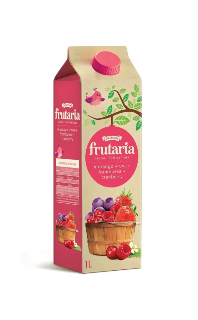
A one-liter gable-top carton of Frutaria fruit nectar stands upright, featuring a kraft paper base with a vibrant magenta side panel and a matching pink screw cap. The front face displays a large circular magenta badge containing the brand name in white script above a list of ingredients—morango (strawberry), uva (grape), framboesa (raspberry), and cranberry—while an illustration of a wooden basket overflowing with photorealistic berries anchors the lower composition. A stylized tree branch with green leaves and a small pink bird extends across the upper right corner, complementing the nutritional information table printed vertically on the left flank.
Visual interest derives from the deliberate contrast between the earthy, recycled-paper texture of the main container and the saturated pink accents that unify the branding elements. The hybrid illustration style merges flat, whimsical graphics of foliage and fauna with high-definition photographic renderings of the fruit, creating a layered depth that suggests both natural authenticity and playful accessibility. Typography alternates between elegant serif lettering for the premium designation and clean sans-serif fonts for the multilingual ingredient list, establishing a clear hierarchy that guides the eye from brand identity to product specifics.
Packaging designers studying beverage market trends would examine this carton to understand how color psychology and mixed-media imagery communicate flavor profiles and quality tiers. Brand strategists could analyze the layout to evaluate how nutritional transparency and premium labeling coexist within limited retail shelf space. Illustrators specializing in food packaging might reference the integration techniques used here when combining vector botanical elements with photographic assets for similar consumer goods.