Junde Tea Lapsang Souchong Tea Can
Topics
Details
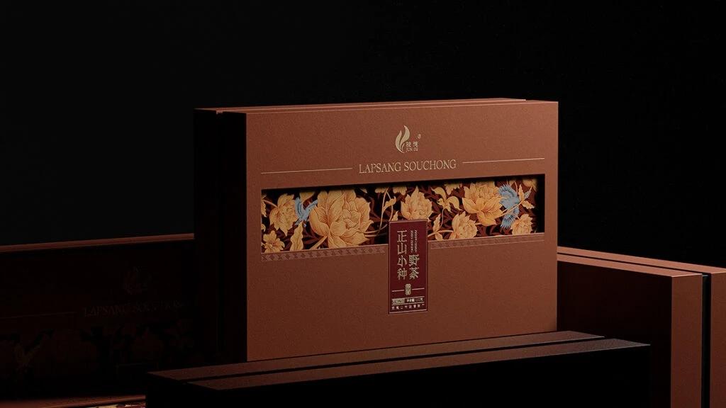
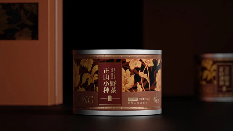
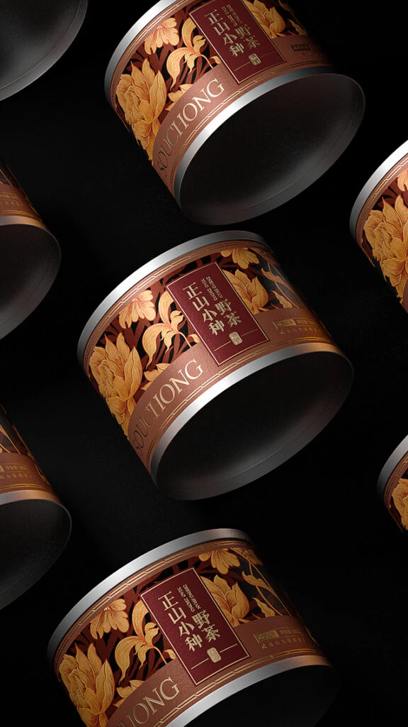
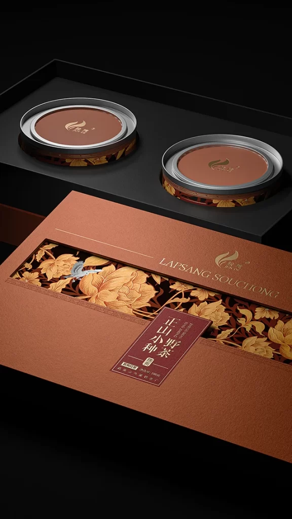
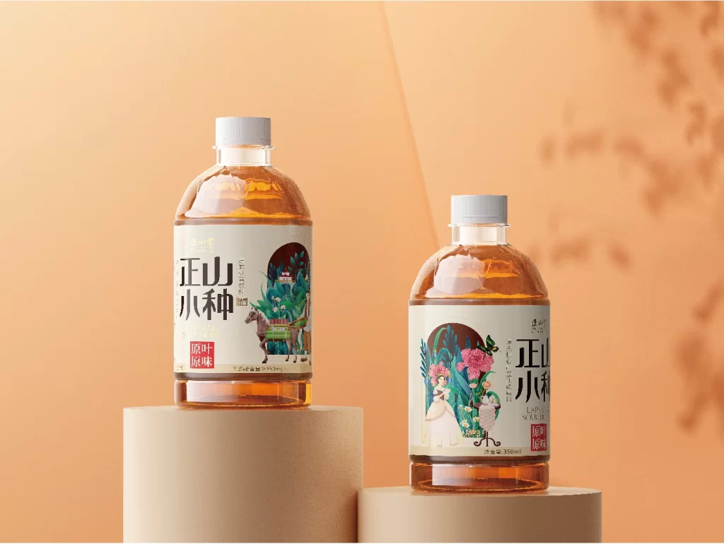
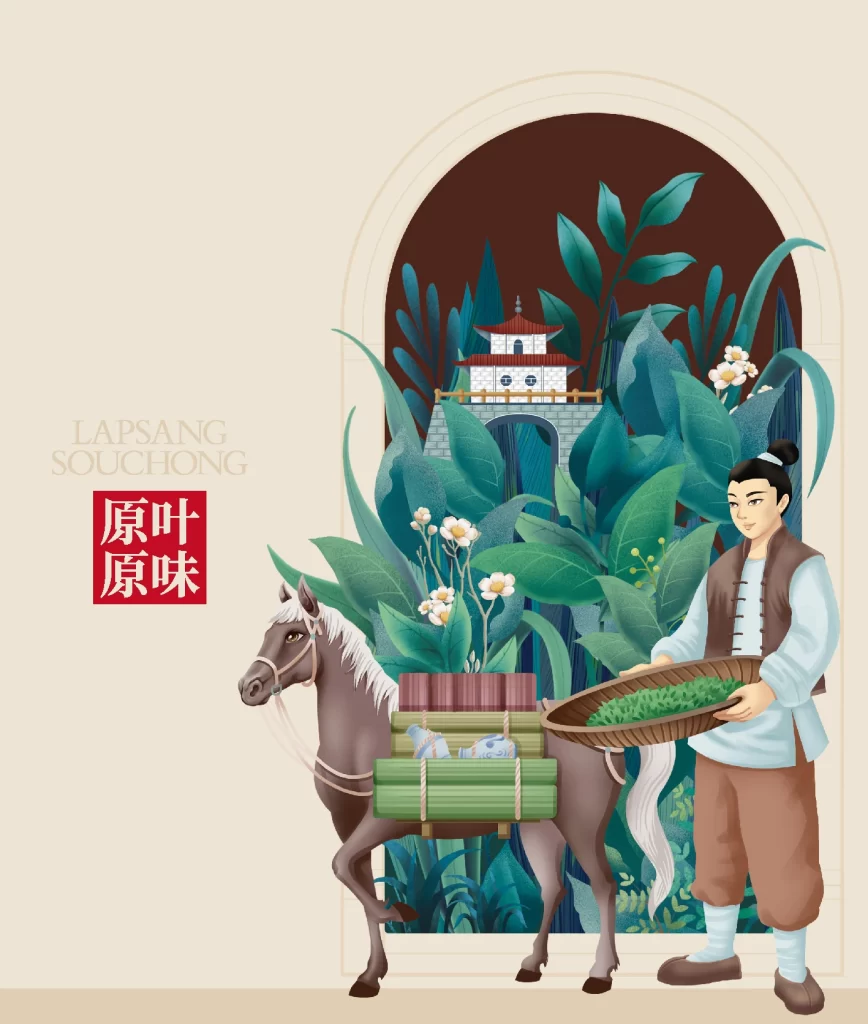
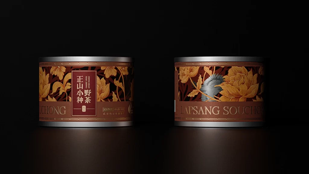
Set against an impenetrable black void, two cylindrical metal tins sit side-by-side, their silver rims catching a soft, directional light that creates subtle gradients across their curved surfaces. The left tin displays a deep maroon label with vertical gold Chinese characters reading '正山小种野茶' (Zhengshan Xiaozhong Wild Tea), framed by intricate golden floral patterns on a dark brown background. Its counterpart reveals the English translation 'LAPSANG SOUCHONG' in serif capitals beneath a detailed illustration of a blue-grey bird nestled among oversized golden peonies, with the word 'SOUCHONG' partially visible at the bottom left of the first container.
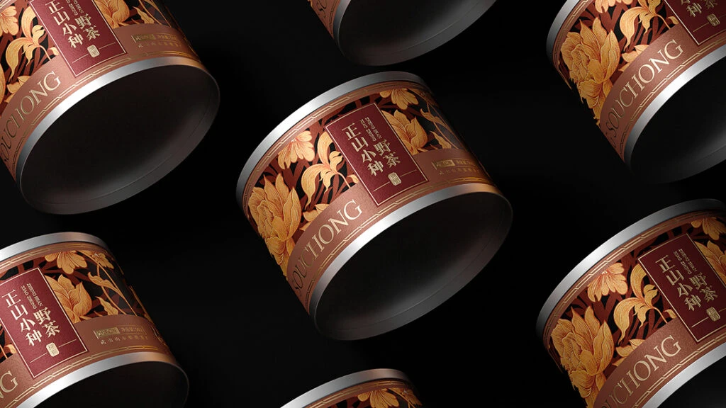
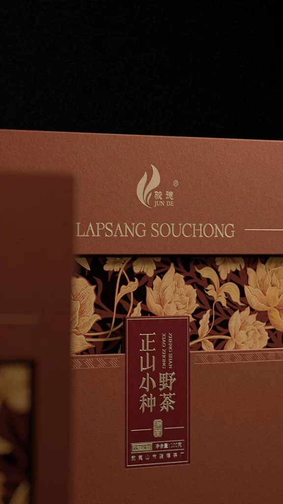
Visual distinction emerges from the sophisticated interplay between traditional Chinese typographic hierarchy and Western botanical illustration styles, creating a cross-cultural aesthetic that feels both heritage-rich and contemporary. The metallic substrate provides a cool industrial counterpoint to the warm, organic palette of burnt sienna, antique gold, and deep burgundy, while the embossed-looking floral motifs add tactile depth to the flat surfaces. Careful attention to negative space around the central text blocks prevents visual clutter despite the ornate pattern density, demonstrating masterful balance in luxury packaging composition.
Brand strategists developing premium tea lines would examine this reference to understand how dual-language labeling can maintain cultural authenticity while appealing to international markets. Packaging engineers might study the cylindrical form factor and material transitions between metal and printed wrap to inform structural decisions for similar high-end consumer goods. Art directors working on historical or botanical themes could analyze the color harmonies and illustrative techniques to guide their own visual direction for products requiring an aura of artisanal craftsmanship.