Juyuanxiang Tea Box
Topics
Details
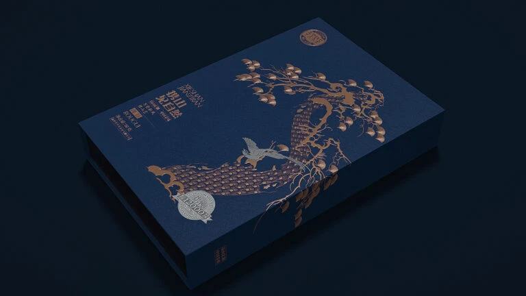
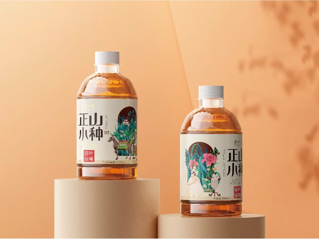
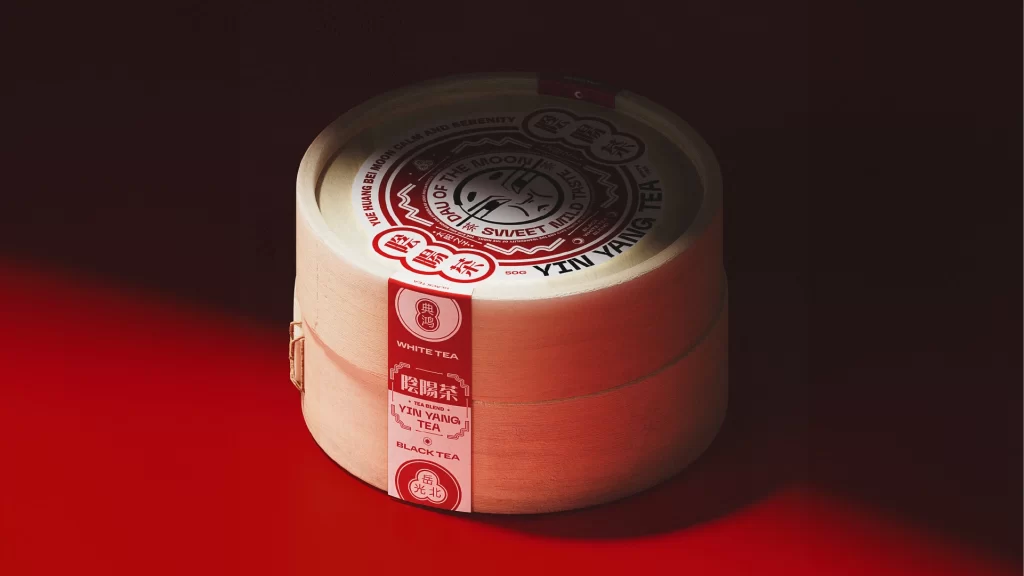
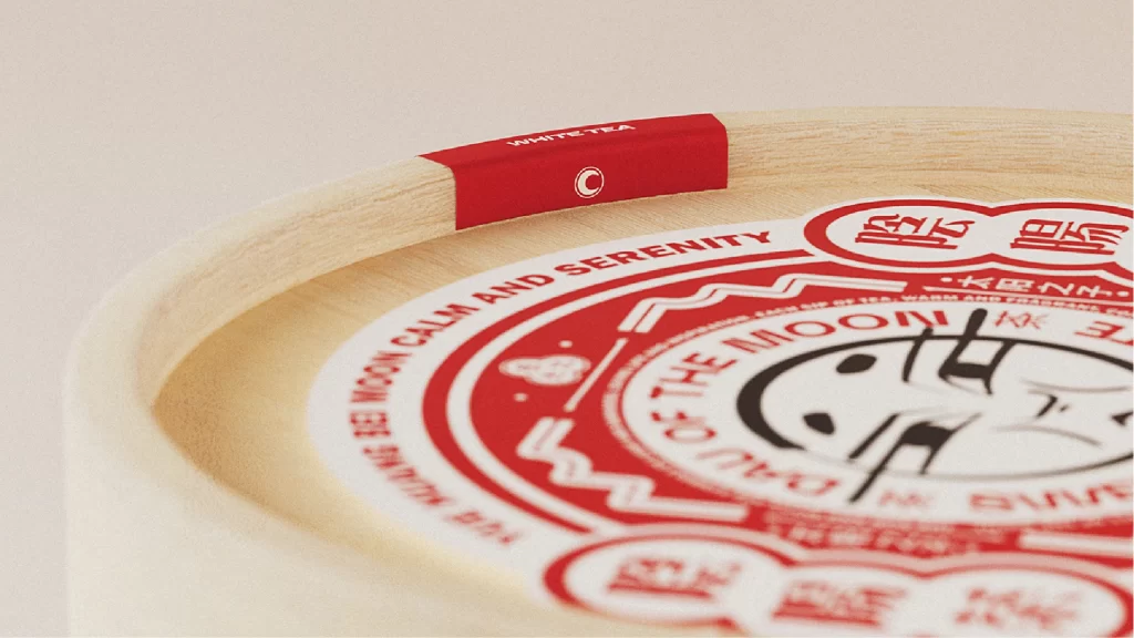
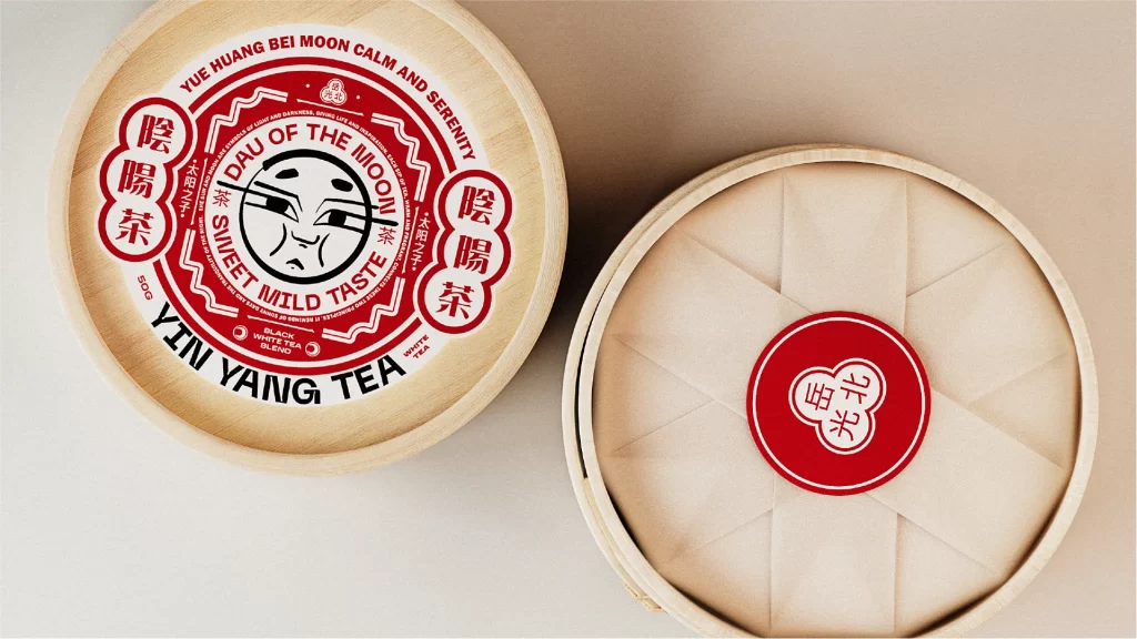
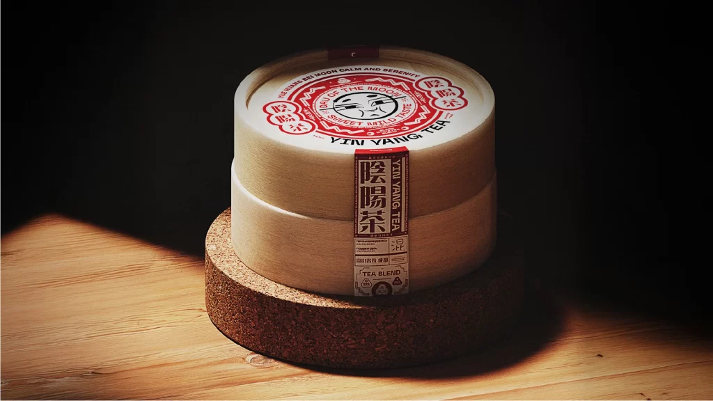
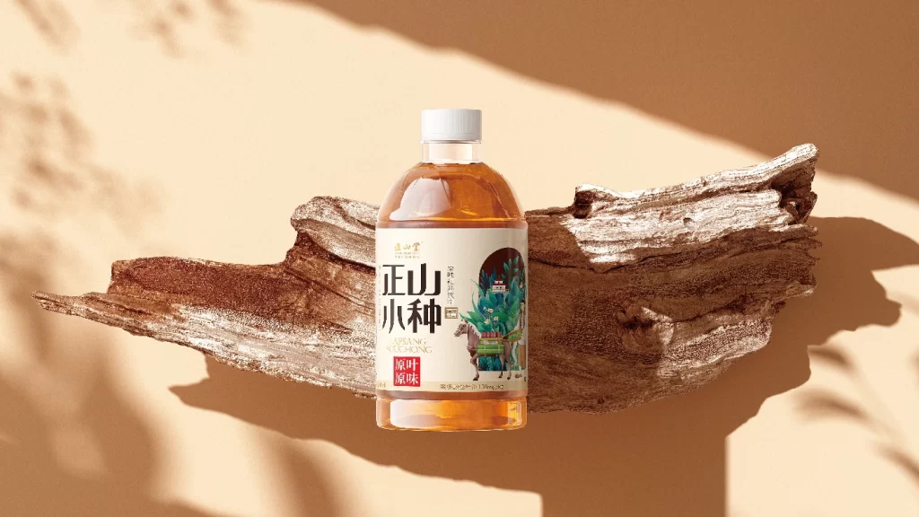
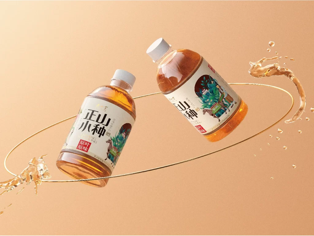
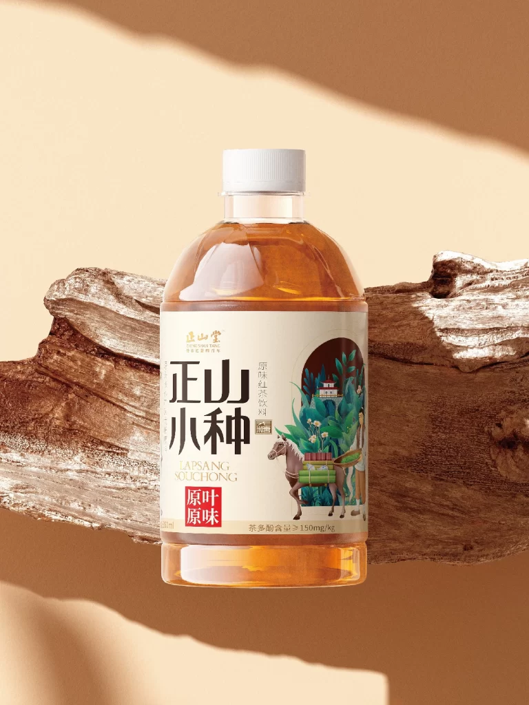
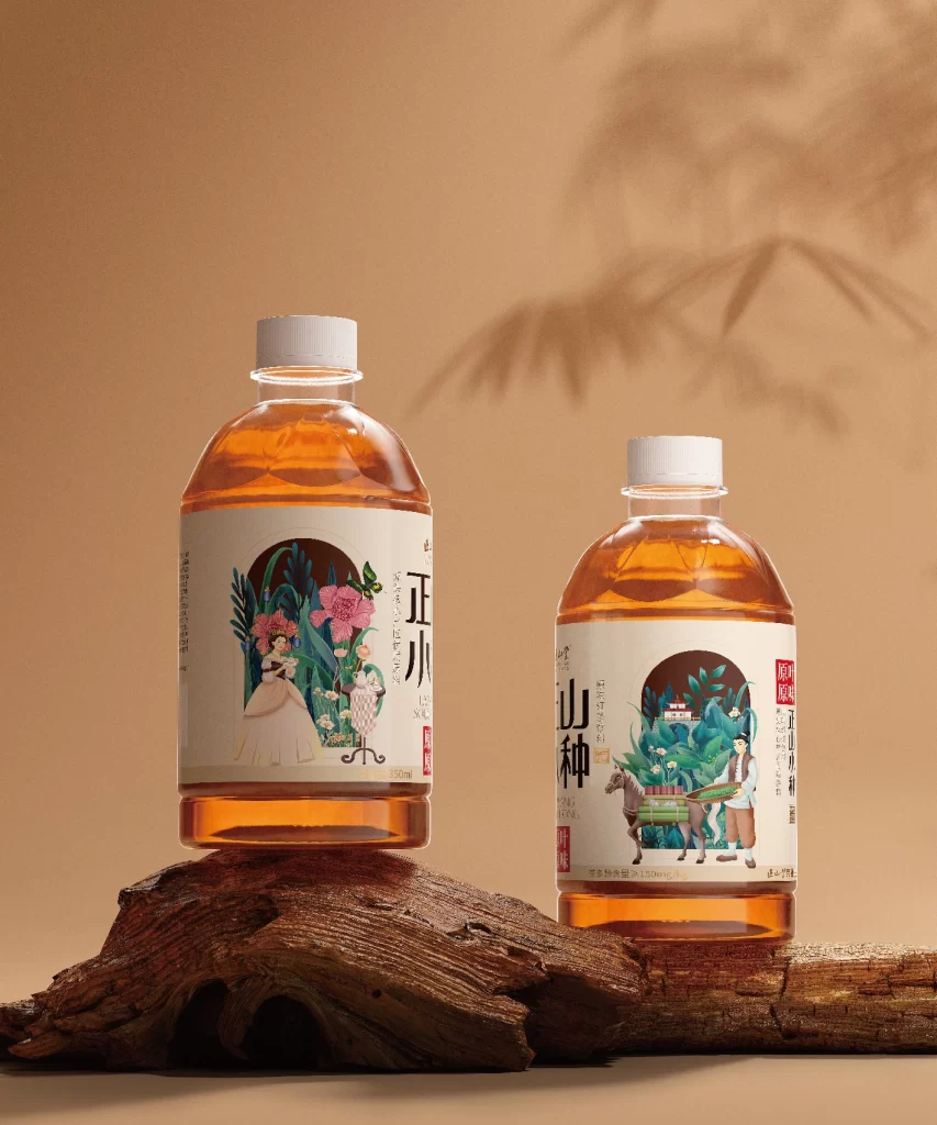
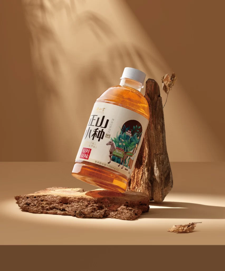
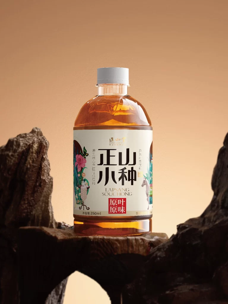
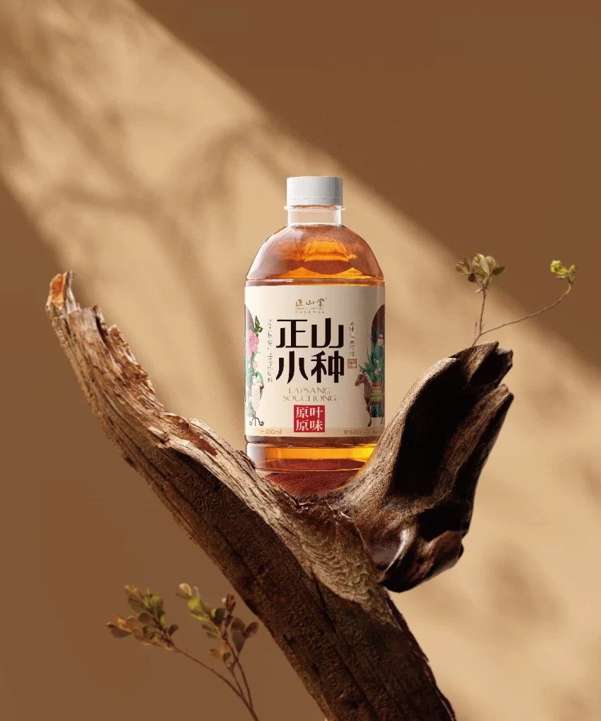
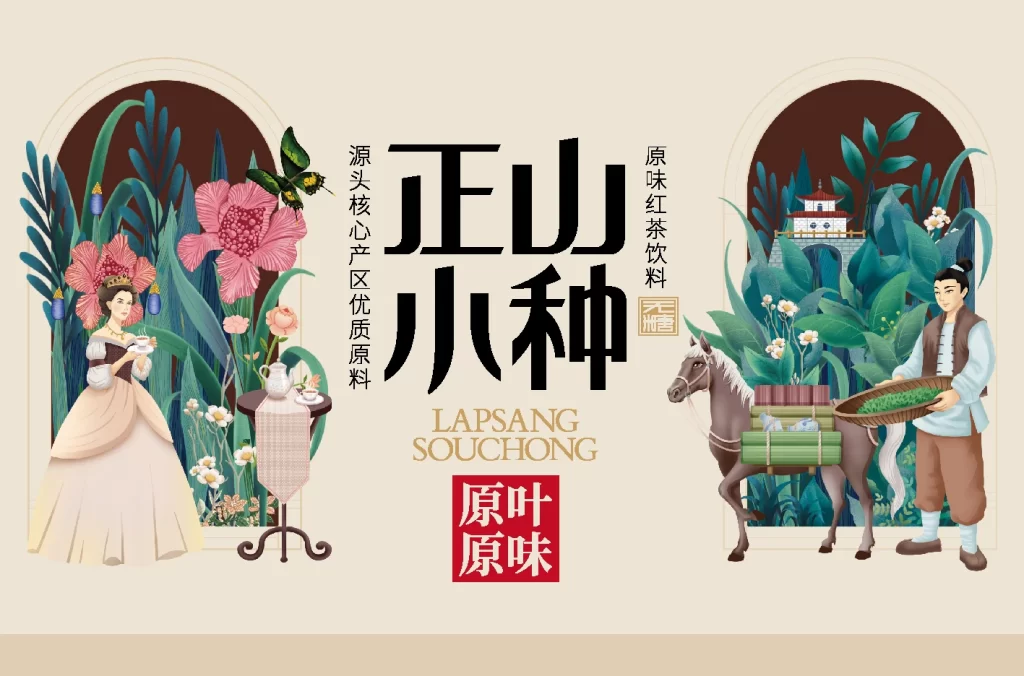
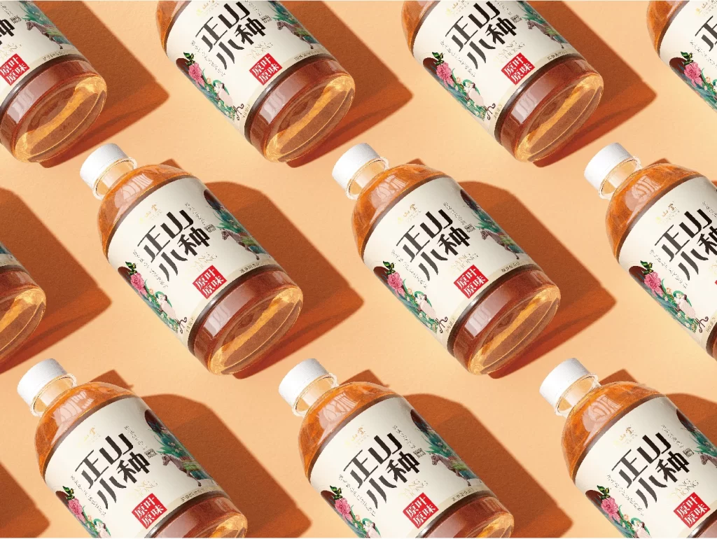
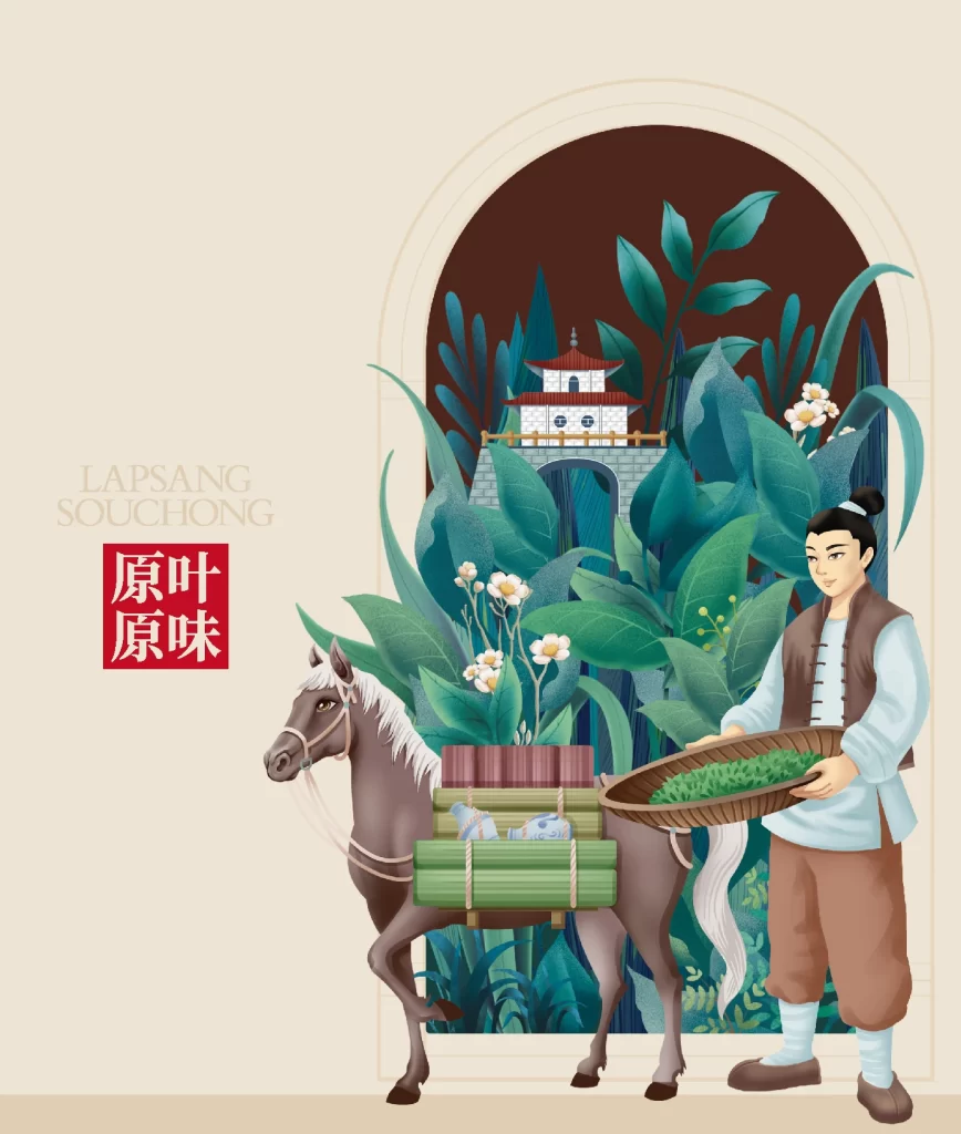
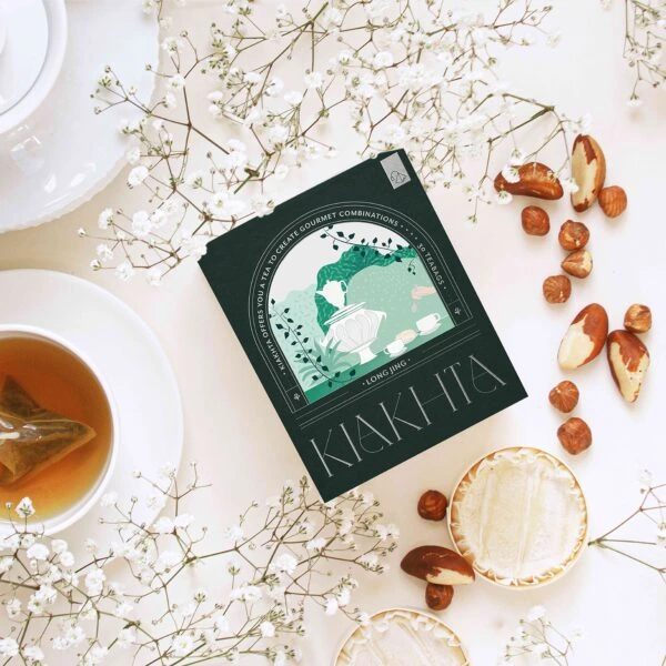
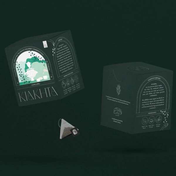
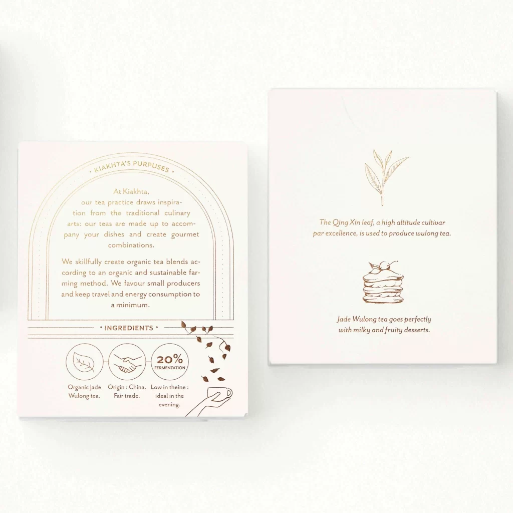
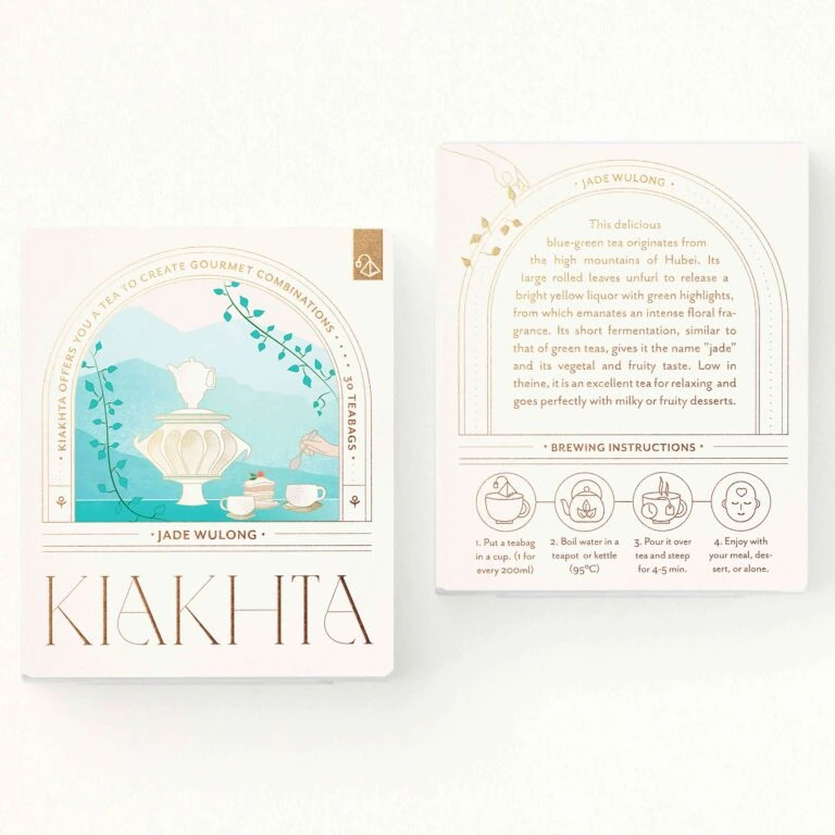
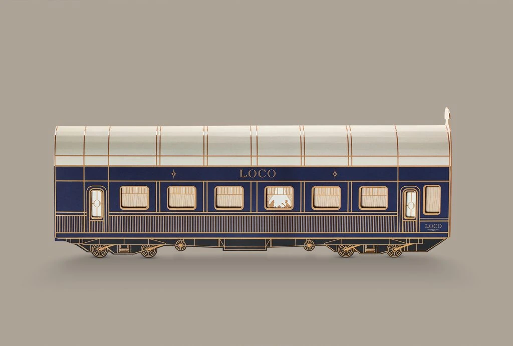
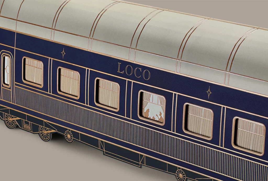
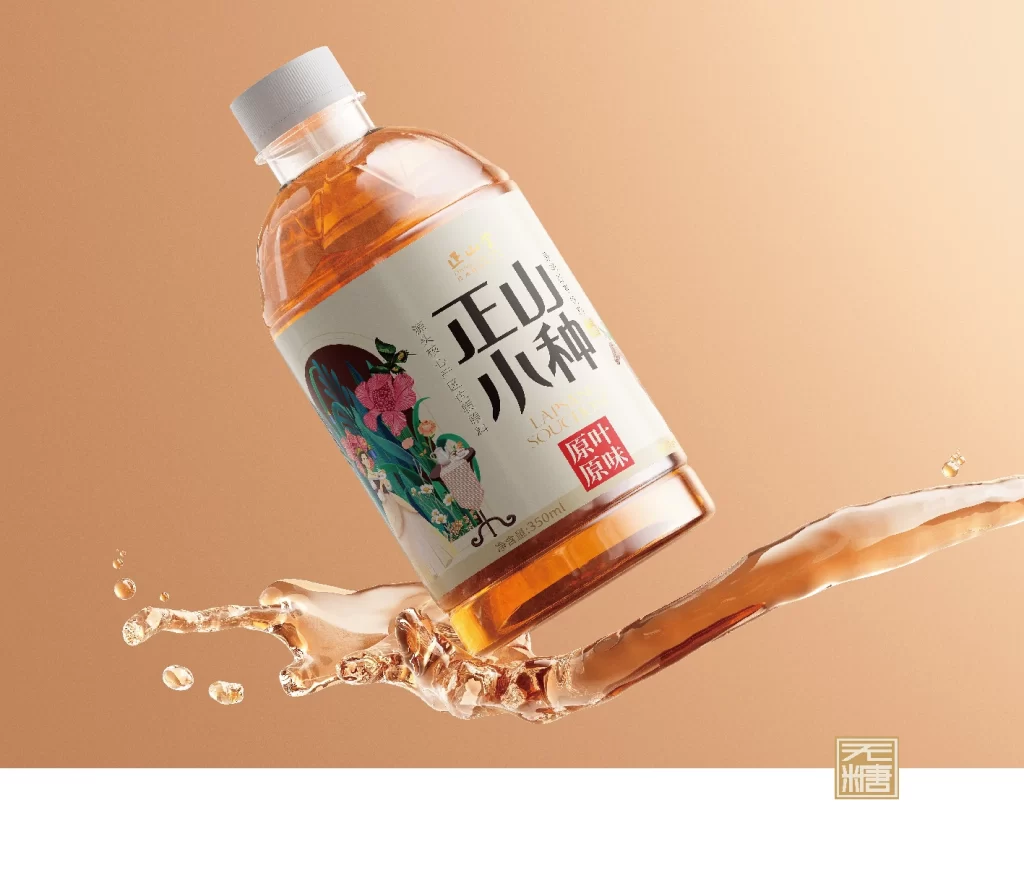
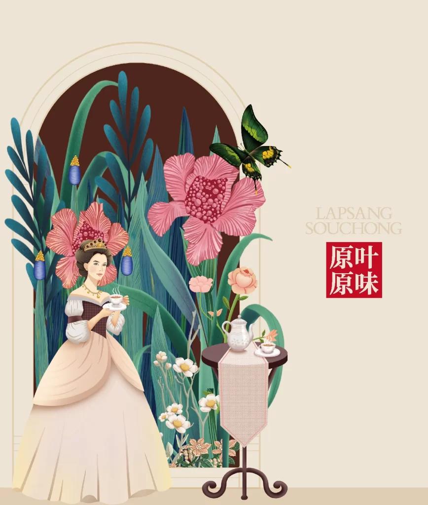
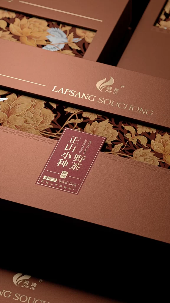
A warm, copper-brown matte surface dominates the composition, interrupted by a deep burgundy label and a contrasting dark maroon panel featuring intricate golden floral illustrations. The camera captures the packaging from a low, oblique angle, emphasizing the layered depth of the box construction where the English text 'LAPSANG SOUCHONG' appears in elegant serif typography alongside a stylized flame logo. Soft, directional lighting highlights the tactile texture of the paper stock while casting subtle shadows that define the edges of the die-cut windows revealing the ornate botanical patterns beneath.
Visual distinction is achieved through the sophisticated interplay of metallic gold foil stamping against the earthy, muted background tones, creating a sense of luxury without relying on bright or saturated colors. The juxtaposition of traditional Chinese calligraphy on the central label with Western typography demonstrates a refined approach to cross-cultural branding, while the detailed peony motifs add an artisanal quality that suggests handcrafted precision. Such careful attention to typographic hierarchy and material finish elevates standard product packaging into a collectible object.
Brand strategists developing premium FMCG identities might study this execution to understand how restrained color palettes can convey heritage and value. Packaging engineers could analyze the structural layering and window integration to inform their own designs for high-end gift sets. Art directors working on editorial layouts for luxury lifestyle publications would find the color harmonies and compositional balance useful when art-directing still-life photography shoots featuring artisanal goods.