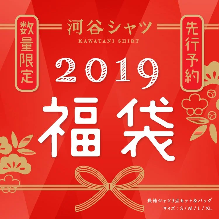
Kawatani Shirt 2019 Red Gold Minimalist Design
Topics
Details
A vibrant red field serves as the canvas for this promotional graphic, featuring a central composition of white and gold typography. The brand name 'KAWATANI SHIRT' appears in gold at the top, flanked by two vertical red badges with gold borders containing the Japanese characters for 'Limited Quantity' and 'Pre-order'. Dominating the center are the numerals '2019' in a textured white font above the large, bold kanji for 'Lucky Bag', while decorative gold botanical motifs and a ribbon bow anchor the lower portion.
Visual interest stems from the deliberate contrast between the saturated crimson background and the metallic gold accents that frame the textual elements. The typographic hierarchy skillfully balances Western numerals with traditional Japanese script, creating a cultural fusion that feels both festive and commercial. Subtle diagonal striations across the red surface add depth without overwhelming the clean, celebratory aesthetic typical of New Year retail campaigns in Japan.
Brand strategists analyzing seasonal marketing in East Asian markets would find this useful for studying color psychology in limited-edition product launches. Typography researchers could examine how mixed-script layouts maintain readability while conveying urgency through vertical banner placements. Retail designers planning fortune-bag promotions might reference the balance between decorative flourishes and essential sizing information displayed at the bottom right.