Kettle of Fish Sea Salt Flakes Box Packaging
Topics
Details
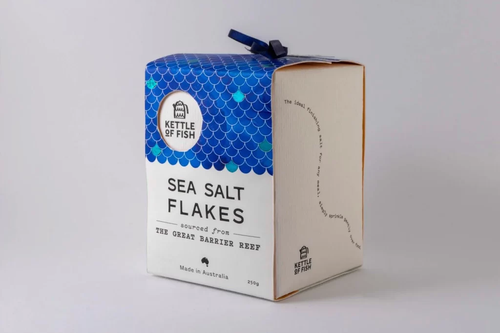
A cubic cardboard carton for Kettle of Fish Sea Salt Flakes presents a striking dual-material composition, wrapping the upper half in a vibrant blue fishscale pattern while the lower portion remains a natural kraft paper. The front face displays bold black typography announcing the product name and its origin from the Great Barrier Reef, accompanied by a circular white logo containing a stylized fish icon. A dark navy ribbon ties across the top flap, and the side panel features curved text describing the salt's ideal qualities, all set against a neutral light-gray studio backdrop with soft, even lighting from a three-quarter angle.
Visual distinction emerges primarily from the meticulous fishscale motif that evokes marine textures through overlapping semicircles in varying blue tones, creating an immediate oceanic association without literal imagery. The deliberate material contrast between the glossy printed upper section and the matte unbleached cardboard below establishes a tactile hierarchy that suggests premium craftsmanship. Typography choices balance modern sans-serif weight for product identification with smaller, more delicate lettering for provenance details, resulting in a cohesive brand identity that feels both artisanal and contemporary.
Packaging designers studying sustainable material combinations would examine this piece to understand how partial-coverage printing reduces ink usage while maintaining visual impact. Brand identity specialists could reference the integration of organic patterns with geometric container forms when developing coastal or seafood-related product lines. Retail merchandisers might analyze the three-dimensional presentation to inform how similar boxed goods should be photographed for e-commerce platforms, particularly regarding how side-panel text curves around corners to maintain readability from multiple angles.