Kikkoman Organic Soy Sauce Bottle Packaging
Topics
Details
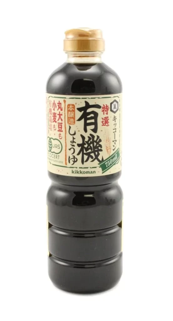
The product is presented as a single dark cylindrical soy sauce bottle featuring a ribbed lower section and a gold screw cap, set against a plain white studio background. A light beige label wraps around the upper portion of the container, prominently displaying the large Japanese characters for organic alongside smaller red and black text.
Kikkoman utilizes this packaging to highlight its specific line of organic soy sauce while signaling a deep Japanese brewing heritage through traditional typography. The inclusion of certification marks and the brand logo at the bottom reinforces the product's authenticity and commitment to quality ingredients.
Packaging designers can gain valuable insights from this example of Japanese condiment branding, particularly regarding the balance between modern organic certifications and classic visual elements. The clean product photograph effectively showcases how minimal color palettes and strategic text placement can convey premium quality.