Kitehill Almond Milk Yogurt Vanilla Dairy Free
DownloadTopics
Details
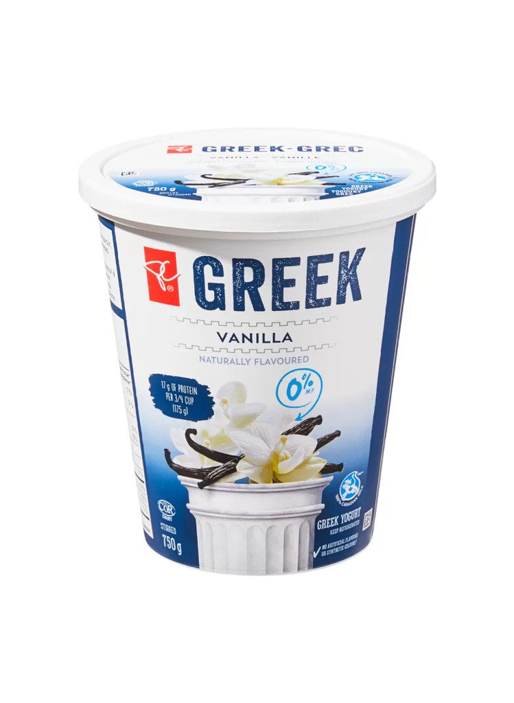
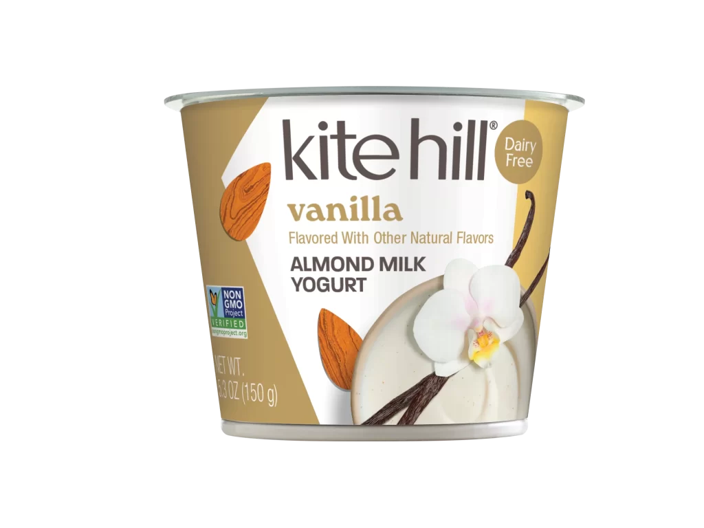
A cylindrical plastic cup of Kite Hill vanilla almond milk yogurt sits at a slight three-quarter angle, revealing its metallic silver rim and the label wrapped around its curved surface. The packaging design features a split background of warm tan and clean white, with the brand name 'kite hill' rendered in bold dark gray lowercase letters above the golden 'vanilla' flavor designation. Visual elements include two textured brown almond illustrations, a white orchid bloom with a yellow center, and dark vanilla bean pods resting atop a pale cream-colored yogurt swirl in the lower right quadrant.
The label composition balances organic imagery with clear typographic hierarchy, using the Non-GMO Project Verified seal and a circular 'Dairy Free' badge to communicate dietary attributes without cluttering the primary branding area. Color choices create visual warmth through the tan sections while maintaining readability with high-contrast text, making this specific variant's packaging distinct from competitors that often rely on cooler palettes for dairy alternatives. Designers studying food packaging can access the full-resolution file to examine how natural flavor cues integrate with regulatory certification marks.
Product photographers might reference this shot to understand standard e-commerce lighting setups that eliminate harsh shadows while preserving surface texture details on glossy containers. Packaging engineers could analyze the spatial arrangement of mandatory nutritional information versus decorative elements when planning similar dairy-free product lines. Brand strategists evaluating plant-based market positioning will find the visual language here useful for comparing how competitors signal 'natural' versus 'processed' qualities through color psychology alone.