Kraken Fish Packaging Illustration
Topics
Details
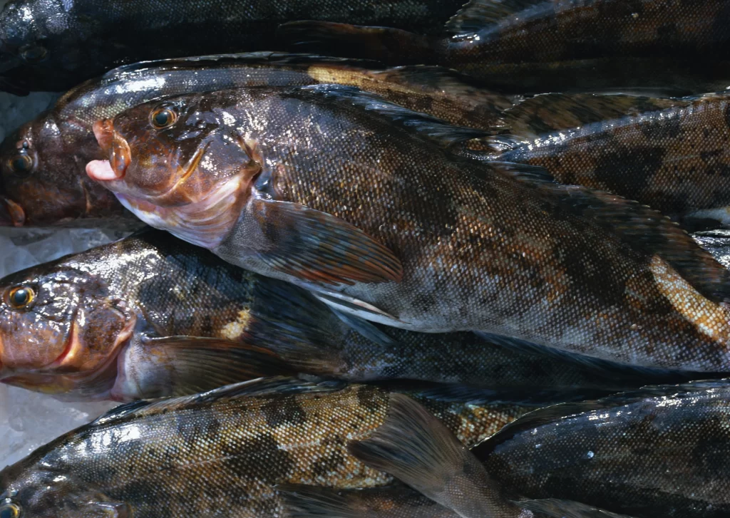
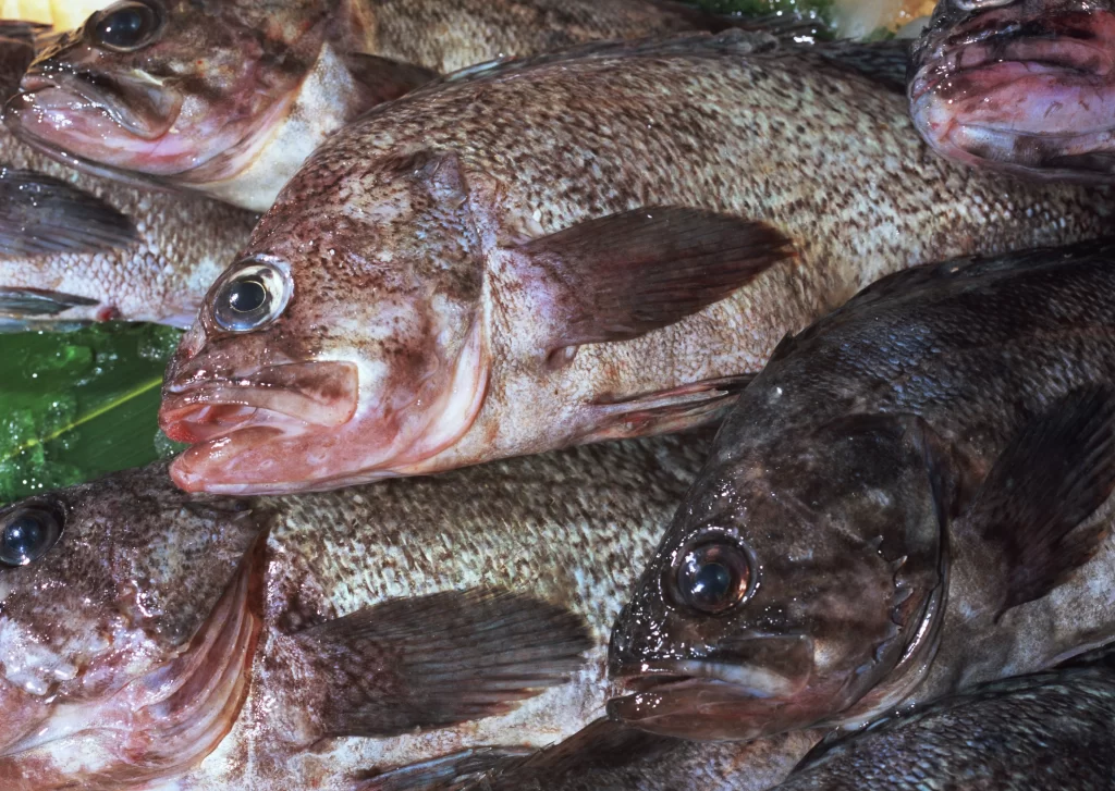
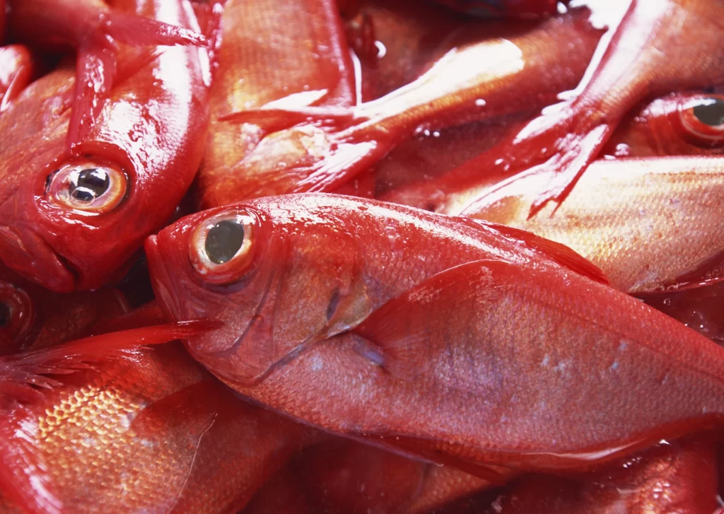
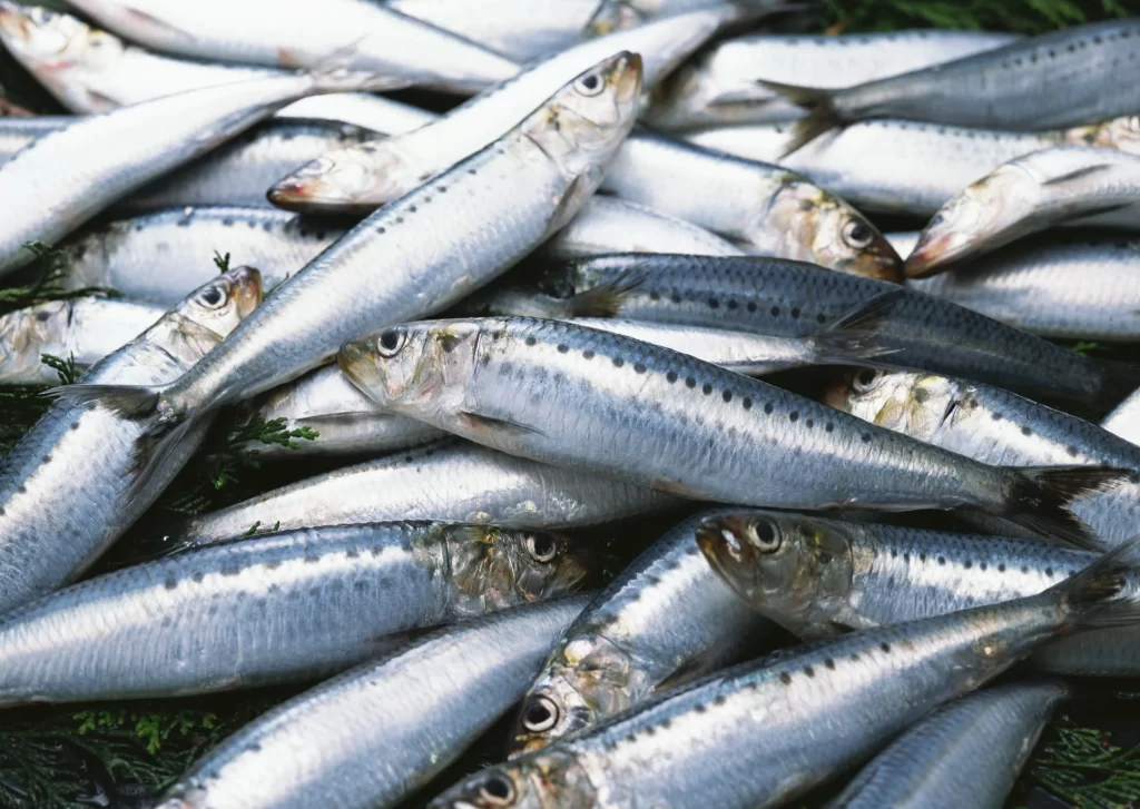
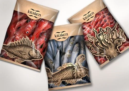
Three kraft paper pouches bearing the brand name 'kraken' display a sophisticated interplay of photographic seafood and vintage-style illustration. The left and right bags feature vibrant red fish imagery, while the center bag contains muted blue-gray sardines, each overlaid with intricate, metallic-gold line art of a fish or octopus. Arranged in a loose triangular formation on a neutral gray surface, the packages catch soft light that emphasizes the matte texture of the paper and the glossy sheen of the printed fish photographs.
Visual distinction arises from the deliberate juxtaposition of realistic photography with ornate, engraving-inspired illustrations that evoke maritime folklore and antique naturalist drawings. The limited color palette—dominated by warm reds, cool blues, and antique gold against earthy brown paper—creates a cohesive yet varied product family identity. Typography remains minimal and understated within an oval cartouche, allowing the detailed biological artwork to command immediate attention.
Brand strategists developing premium seafood lines might examine this composition to understand how historical illustration styles elevate commodity products into luxury goods. Packaging engineers could analyze the structural layout of graphic elements across different bag orientations to optimize shelf presence. Art directors seeking to blend photorealism with hand-drawn aesthetics will find concrete examples of scale, layering, and color harmony between disparate visual modes.