Lamill Coffee Ethiopia Yirgacheffe Bag
Topics
Details
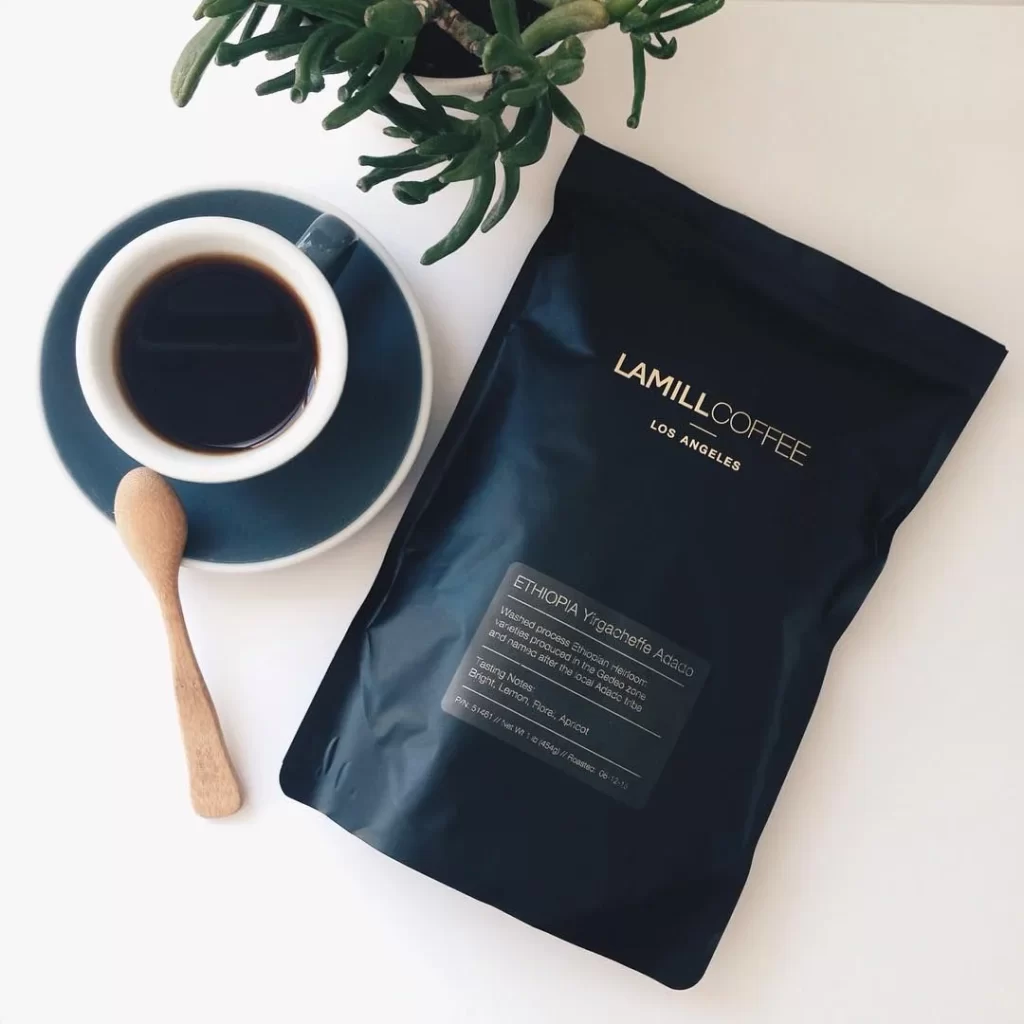
A matte black coffee bag with gold foil lettering spelling out LAMILL COFFEE LOS ANGELES dominates the right side of the frame, its surface catching soft directional light that reveals subtle creases in the packaging material. To the left, a white ceramic cup filled with dark coffee sits atop a deep teal saucer, accompanied by a light-grained wooden spoon, while the trailing leaves of a succulent plant drape into the upper quadrant from above. The entire arrangement rests on an off-white surface illuminated by diffused natural lighting coming from the upper left, casting gentle shadows beneath each object and emphasizing the contrast between the bag's dark finish and the lighter elements surrounding it.
The visual hierarchy relies on typographic restraint and material contrast rather than decorative graphics, with the gold serif font creating immediate luxury associations against the utilitarian black substrate. A secondary gray label provides detailed origin information—Ethiopia Yirgacheffe Adado—in clean sans-serif type, establishing a two-tier information system that balances brand identity with product specificity. This approach demonstrates how minimalist labeling can convey premium positioning through texture interplay and precise color selection rather than complex illustration or photography.
Packaging designers studying luxury commodity branding would examine this composition to understand how foil stamping interacts with matte substrates under varied lighting conditions. Art directors developing mood boards for lifestyle photography could reference the spatial relationships between organic materials like wood and ceramic against manufactured packaging to achieve balanced visual weight. Brand strategists might analyze the typographic scale differences between the primary logo and secondary descriptive text to inform their own hierarchy decisions for specialty food products.