Lipstick Tube Black Red Rouge Infusion Minimalist Design
Topics
Details
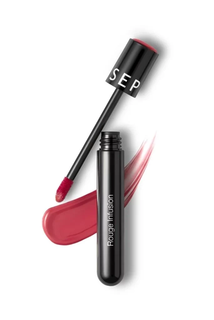
Glossy black cylindrical tubes dominate the frame, one standing upright with 'Rouge Infusion' printed vertically in white sans-serif lettering while the other lies diagonally with its cap showing the partial brand name 'SEP'. A doe-foot applicator extends from the angled tube, its tip saturated in a rich crimson pigment that matches the bold smear curving beneath the packaging. Soft, diffused lighting creates gentle shadows that emphasize the sleek metallic finish of the containers and the creamy texture of the cosmetic swatch.
The visual appeal lies in the striking contrast between the matte black architecture and the vibrant red product, creating an immediate focal point that draws the eye to the color payoff. Minimalist typography and clean geometric forms give the composition a modern, luxurious aesthetic that feels both professional and approachable. The deliberate arrangement of open and closed components showcases both the packaging design and the actual formula consistency in a single cohesive view.
Product photographers might study this layout to understand how to balance multiple object states within a single frame without cluttering the visual field. Brand designers could analyze the typographic hierarchy and color relationships to inform their own cosmetic packaging concepts. Marketing teams developing lookbooks for beauty brands would find this arrangement useful for planning assets that highlight both container aesthetics and product performance simultaneously.