Liucha Fang Black Tea Box
Topics
Details
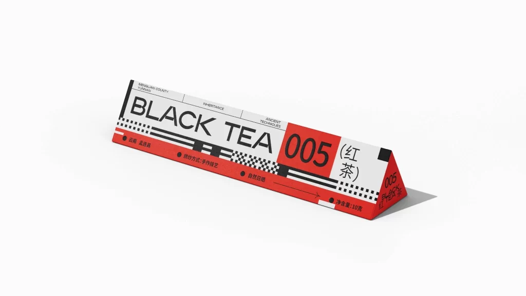
Set against a sterile white void, a long, triangular prism of packaging commands attention through its stark geometric precision. The object features a dominant white face bisected by a bold red horizontal band, with the typography 'BLACK TEA 005' rendered in heavy, sans-serif lettering. Soft, diffused lighting casts a subtle drop shadow to the right, emphasizing the three-dimensional form while the camera maintains a slight isometric perspective that reveals both the primary label and the red side panel.
Visual interest is generated by the deliberate collision of industrial graphic elements and traditional product information. The design employs a high-contrast palette of crimson, jet black, and off-white, utilizing checkerboard patterns and thick rule lines to create a rhythm reminiscent of technical schematics or shipping manifests. By juxtaposing English nomenclature with vertical Chinese characters and specific regional data like 'Menglian County,' the aesthetic bridges modernist minimalism with authentic cultural specificity.
Brand strategists and packaging engineers would utilize this artifact to study how typographic hierarchy can be maintained across non-rectangular substrates. Furthermore, art directors working on premium commodity goods might reference this layout to understand how to balance dense informational requirements with negative space. The specific arrangement of bullet points and arrows also serves as a functional case study for organizing complex logistical data within a luxury retail context.