Liucha Fang Oolong Tea Box
Topics
Details
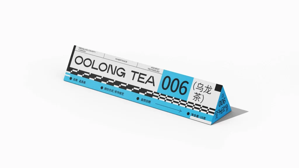
Set against a seamless white background, a long, triangular prism-shaped tea box rests at an oblique angle, casting a soft shadow to its right. The packaging features a stark palette of matte white and bright cyan blue, accented by bold black typography and a geometric checkerboard pattern running along the lower edge. Visible text includes the large English words 'OOLONG TEA' and the number '006' in a cyan block, alongside Chinese characters for 'Oolong Tea' and specific details such as 'Menglian County, Yunnan', 'Hand-crafting techniques', 'Natural sun-drying', and 'Net content: 10g'.
Visual interest derives from the unconventional elongated form factor, which mimics the proportions of a racing banner or a technical label rather than a traditional consumer carton. The juxtaposition of clean sans-serif English lettering with concise Chinese descriptors creates a bilingual hierarchy that feels both industrial and artisanal. Furthermore, the high-contrast cyan accent draws immediate focus to the product code while the rhythmic black-and-white stripe adds a sense of dynamic movement to the otherwise static object.
Brand strategists might examine this artifact to understand how minimalist geometry can convey heritage and craftsmanship without relying on ornate imagery. Packaging engineers could utilize the perspective view to study how structural shapes influence shelf presence and spatial efficiency. Additionally, typographers will find value in analyzing the balance between oversized display fonts and smaller informational text within a constrained, three-dimensional layout.