Liucha Fang Pu’er Tea Box
Topics
Details
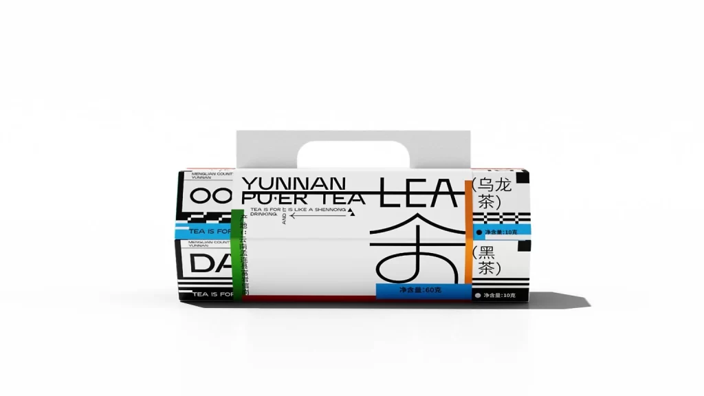
Presented against a stark white void, a rectangular carton of Yunnan Pu'er tea sits centered in the frame, illuminated by soft, diffused light that casts a subtle shadow to the right. The packaging features a predominantly white surface overlaid with bold, black sans-serif typography spelling out 'YUNNAN PU'ER TEA' and a large, stylized Chinese character. Vibrant accents of cyan and orange define vertical information panels on the flanks, while a green strip on the left side displays vertical Chinese text regarding the product's origin.
Visual interest is generated through a complex interplay of typographic hierarchy and geometric color blocking that merges modern graphic sensibilities with traditional product information. The layout utilizes high-contrast black lines and varied font weights to create a dynamic, almost architectural structure on the flat surface of the box. By integrating English descriptors with prominent Chinese characters and specific weight measurements, the design achieves a distinctive bilingual aesthetic that feels both contemporary and rooted in regional identity.
Brand strategists and packaging designers might examine this object to study how maximalist typography can be balanced with ample negative space to maintain legibility. Art directors working on beverage branding could utilize this as a case study for applying Swiss-style design principles to traditional Eastern commodities. Furthermore, students of visual communication could analyze the specific way color coding is employed here to differentiate between internal product varieties like Oolong and Black tea.