Liucha Fang Tea Box Closeup
Topics
Details
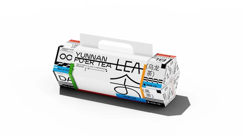
A white rectangular tea box with a built-in handle sits at a three-quarter angle, showcasing bold black typography that spells out 'YUNNAN PU'ER TEA LEA' across its main face. Vibrant stripes of cyan, green, and orange accent the left and right panels, which also feature Chinese characters for Oolong and Black tea alongside net weight specifications. The packaging displays a mix of geometric patterns and smaller English text, all illuminated by soft studio lighting that casts a clean shadow beneath the matte-finished container.
Visual interest stems from the stark contrast between minimalist geometric forms and dense typographic layering. The design employs a modernist grid system where Latin characters intersect with traditional Chinese script, creating a dynamic visual rhythm. Color-coded bands serve as functional identifiers for different tea varieties while maintaining a cohesive industrial aesthetic that feels both contemporary and rooted in regional heritage.
Brand identity specialists might study this composition to understand how to balance multilingual text hierarchies within constrained packaging spaces. Packaging engineers could reference the structural relationship between the primary rectangular container and the secondary hexagonal attachment. Art directors working on beverage product lines would find this useful for exploring how limited color palettes can effectively differentiate product variants without cluttering the overall design language.