Liucha Fang Tea Box Design
Topics
Details
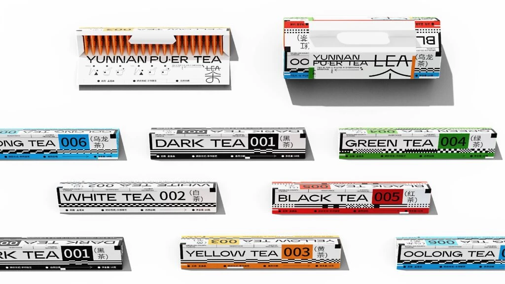
Arranged in a loose grid against a stark white background, nine distinct tea packaging designs are captured from a direct overhead perspective. The collection features two larger rectangular cartons at the top, one displaying exposed orange tea sticks, and seven smaller horizontal boxes below. Each package utilizes a bold, industrial aesthetic with high-contrast black and white bases accented by specific color codes: cyan for Oolong, black for Dark Tea, green for Green Tea, white for White Tea, red for Black Tea, orange for Yellow Tea, and multicolor accents for the Pu'er variants. Typography is dominated by heavy sans-serif English lettering alongside Chinese characters, numerical identifiers like 001 through 006, and technical grid patterns that suggest a modern, data-driven branding approach.
Visual interest is generated through the systematic application of a 'color-coded index' system that categorizes tea types by both number and hue, creating an immediate visual shorthand for the consumer. The design language deliberately mimics technical specifications or architectural blueprints, using barcode-like stripes and geometric blocks to frame the organic product within a rigid, contemporary structure. By blending traditional Chinese tea nomenclature with futuristic, almost cyberpunk-inspired graphic elements, the packaging achieves a unique tension between heritage and modernity.
Brand strategists and packaging engineers can utilize this set to study how modular color systems function across a diverse product line while maintaining brand cohesion. Graphic designers working on identity systems for FMCG goods will find the typographic hierarchy and use of negative space particularly useful for structuring information-dense layouts. Furthermore, art directors developing retail displays can reference the spatial arrangement and color blocking to plan shelf presence that maximizes visual impact through organized repetition.