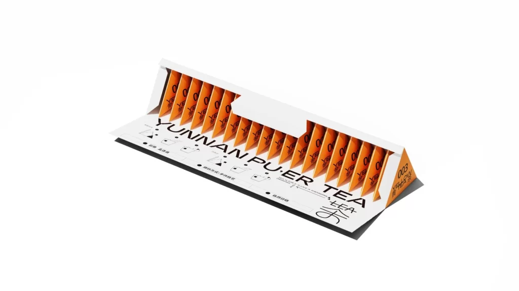
Liucha Fang Tea Box Detail
Topics
Details
A white triangular prism box opens to reveal a row of vibrant orange tea sachets standing upright in individual slots. Bold black typography spelling 'YUNNAN PUER TEA' dominates the front panel, accompanied by Chinese characters and the number 083 printed on the rightmost edge. Soft studio lighting illuminates the matte paper material from a three-quarter angle, highlighting the clean geometric lines and high-contrast color palette.
Visual interest here stems from the clever use of negative space and the dramatic reveal of the product’s inner contents. By utilizing a minimalist color palette of white, orange, and black, the design achieves a modern aesthetic that feels both premium and accessible. The repetitive pattern of the tea bags creates a satisfying visual texture that draws the eye along the length of the package, highlighting the structural integrity of the folding carton design.
Packaging engineers and brand identity specialists would find this specific arrangement useful for studying how to balance information hierarchy with physical structure. It serves as an excellent case study for those looking to implement ‘reveal’ mechanisms in retail packaging that surprise the consumer upon opening. Furthermore, typographers can analyze the interplay between Latin characters and the accompanying Chinese script to understand how bilingual branding functions within a constrained layout space.