Liucha Fang Tea Box View
Topics
Details
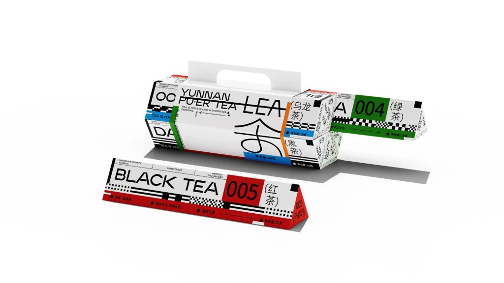
Three angular tea boxes display a bold, modernist aesthetic with white cardboard bases accented by vibrant red, green, and blue color blocks. The packaging features prominent black typography including 'YUNNAN PUER TEA,' 'BLACK TEA 005,' and Chinese characters for various tea varieties, arranged in a dynamic diagonal composition with geometric patterns and racing-style checkered details. Soft studio lighting casts subtle shadows beneath the objects, highlighting the matte paper texture and clean die-cut edges of this contemporary tea collection.
What distinguishes this packaging system is its radical departure from traditional tea aesthetics, embracing instead a brutalist, almost industrial visual language. The design leverages high-contrast black text against stark white backgrounds, punctuated by checkerboard patterns and color-coded segments that function as immediate visual identifiers for different tea varieties. By treating the box as a modular, sculptural object rather than mere container, the designers create a tactile experience where typography becomes texture and structural form communicates brand identity as effectively as the printed word.
Brand strategists and packaging architects will find this composition invaluable when developing identity systems for premium consumer goods that require both shelf presence and unboxing theater. The clear demonstration of how color coding and typographic hierarchy can organize product lines offers practical lessons for anyone tasked with creating cohesive yet distinct SKU variations within a single collection. Furthermore, the interplay between two-dimensional graphic elements and three-dimensional structural design provides concrete guidance for teams seeking to elevate standard rectangular boxes into memorable brand artifacts.