Liucha Fang Tea Box
Topics
Details
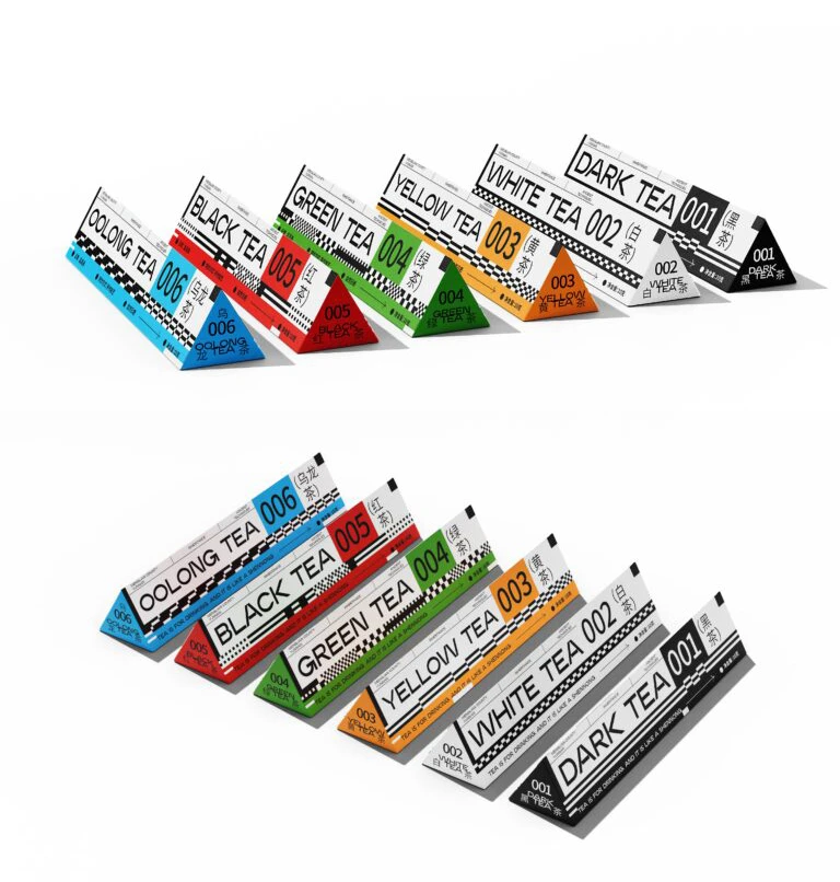
Arranged in two distinct rows against a sterile white void, six triangular prisms display a systematic approach to tea packaging. Each elongated tetrahedron features a specific color coding—black, white, orange, green, red, and blue—corresponding to varieties labeled Dark Tea 001, White Tea 002, Yellow Tea 003, Green Tea 004, Black Tea 005, and Oolong Tea 006. Bold sans-serif typography dominates the matte surfaces, complemented by high-contrast checkered patterns along the edges and smaller Chinese characters that ground the modern aesthetic in traditional origins.
What distinguishes this collection is its rigid adherence to a numeric and chromatic logic that transforms organic products into a sleek, almost industrial design system. The sharp geometric forms reject the typical curves of conventional tea tins, opting instead for an architectural presence that feels both futuristic and orderly. By utilizing a racing-inspired checkerboard motif alongside clean data-like labeling, the visual language bridges the gap between premium commodity and contemporary art object.
Brand strategists seeking to modernize heritage products will find the color-coded hierarchy particularly useful for organizing complex product lines. Packaging engineers can study the structural integrity of these triangular forms to understand how non-standard shapes impact shelf presence and stackability. Furthermore, typographers and layout artists might analyze the balance between English numerals and Eastern script to inform their own bilingual identity projects.