Localtea Tea Packaging
Topics
Details
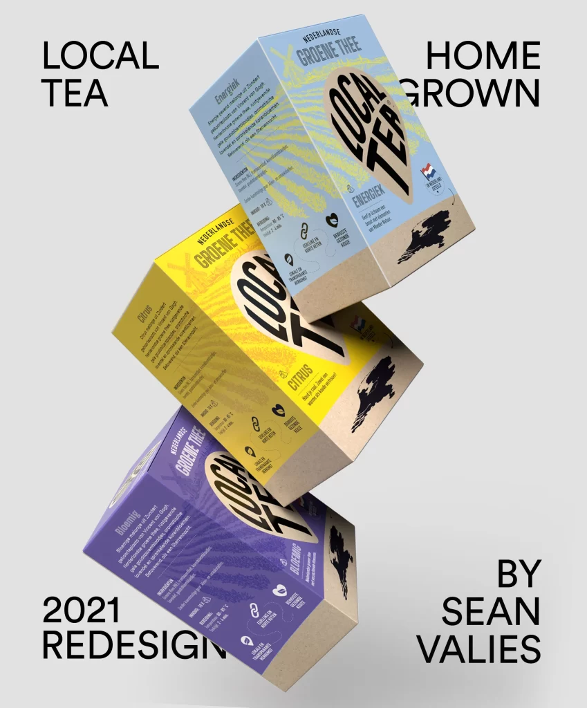
Three rectangular cartons float in a cascading diagonal arrangement against a clean, light gray background, each box tilted to reveal its front and side panels. The packaging features a vibrant color-coded system with light blue, bright yellow, and deep purple faces, all accented by a natural kraft cardboard base and bold, black 'LOCAL TEA' typography set within an organic leaf-shaped frame. Visible text includes the Dutch phrase 'NEDERLANDSE GROENE THEE' alongside flavor identifiers like 'ENERGIEK', 'CITRUS', and 'BLOEMIG', while small icons indicating brewing temperature and sustainability claims line the bottom edge of each design.
What sets this concept apart is its clever fusion of modern minimalism with distinct regional identity, using the silhouette of the Netherlands map as a recurring graphic anchor that grounds the product in its geographic origin. The typographic hierarchy creates immediate visual impact through oversized lettering, yet maintains readability for essential product details, demonstrating how bold branding can coexist with functional information architecture on a three-dimensional surface.
Brand strategists developing eco-conscious consumer goods might study this layout to understand how color psychology can differentiate product variants within a unified family. Packaging engineers could also analyze the structural balance between premium graphical elements and cost-effective material choices like unbleached paperboard for sustainable retail presentations.