Logo Design Label View
Topics
Details
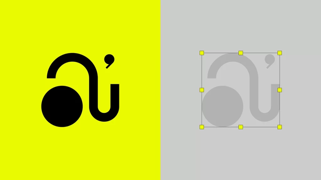
A bold black logo featuring a circular form, a curved hook-like stroke, and a small comma-shaped accent dominates the left side of the image, set against a vibrant yellow background. To the right, the same graphic appears in a muted gray tone on a light gray field, enclosed within a rectangular bounding box marked by eight yellow square handles at its corners and midpoints. The composition presents a side-by-side comparison between a high-contrast finished design and its technical selection state.
Visual weight distribution relies heavily on the extreme contrast between the flat yellow background and the heavy geometric forms, creating immediate legibility even at reduced scales. The juxtaposition of the finalized color version alongside its muted, selected counterpart effectively demonstrates how the logo behaves under different opacity and layering conditions. Such a presentation highlights the structural integrity of the custom letterform, revealing how the circular element balances the negative space created by the sweeping arch.
Brand identity architects might employ this dual-view layout to evaluate color accessibility and contrast ratios during the final approval stages of a visual system. Art directors overseeing asset libraries could reference this specific arrangement when establishing guidelines for logo lockup variations across different media environments. Print production specialists may also find value in observing how the selection handles define the precise safe area and proportions required for consistent reproduction.