Logo Typography Branding
Topics
Details
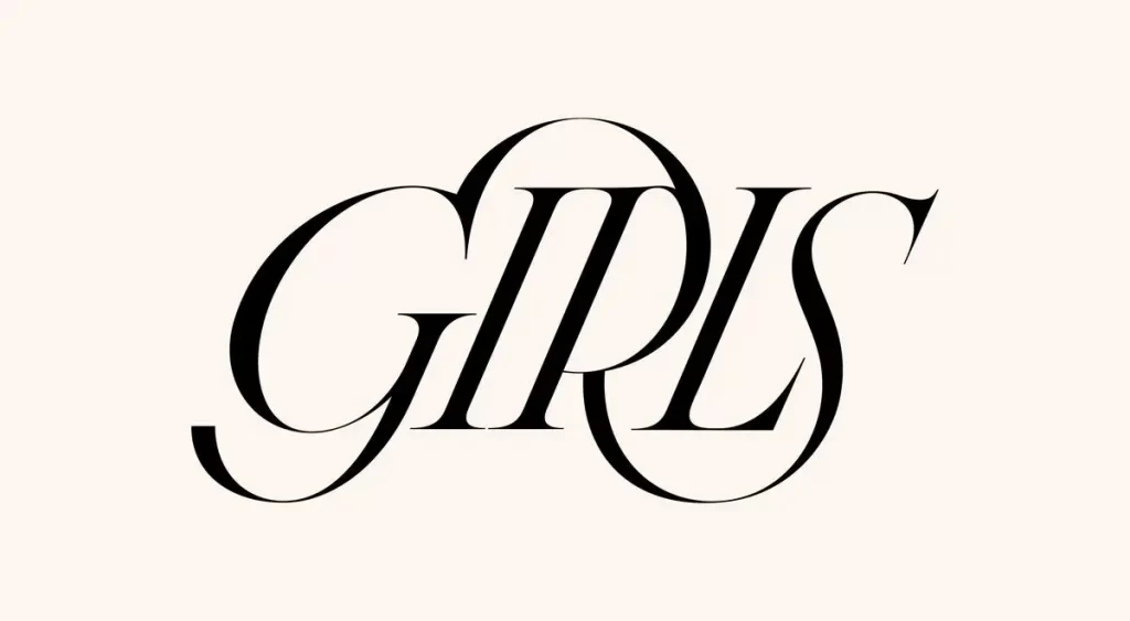
Rendered in solid black against a pale cream background, the word 'GIRLS' appears in an elegant, high-contrast serif typeface. The composition features a lowercase 'g' with a sweeping, circular descender that loops beneath the baseline, while the uppercase 'I', 'R', 'L', and 'S' maintain a consistent vertical alignment. Soft, even lighting illuminates the graphic from a direct frontal perspective, emphasizing the fluid curves and sharp terminals of each character without casting shadows.
Visual interest arises from the sophisticated interplay between the rounded forms of the 'g' and 'S' and the rigid verticality of the central letters. The elongated ascenders and descenders create a sense of vertical rhythm, while the varying stroke widths—thick downstrokes paired with hairline upstrokes—convey a refined, editorial aesthetic. Such typographic choices transform simple text into a decorative mark through deliberate letter-spacing and organic flourishes.
Fashion houses might employ this style for luxury apparel labeling or boutique signage requiring a feminine yet authoritative tone. Editorial teams could adapt similar lettering for magazine mastheads or book cover titles targeting sophisticated audiences. Beauty brands seeking to convey elegance in packaging or promotional materials would find this approach particularly effective for establishing visual identity.