LOreal Hair Care Oil-in-Cream
DownloadTopics
Details
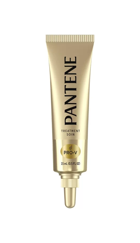
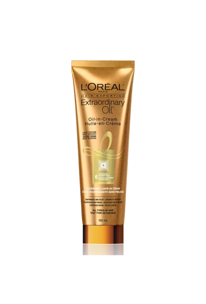
A metallic gold tube stands vertically, its surface catching light with a subtle sheen that suggests a laminated foil finish. The L'Oréal Paris Hair Expertise branding appears in bold black typography above the 'Extraordinary Oil' product name, while bilingual text for 'Oil-in-Cream' and 'Huile-en-Créme' occupies the central visual field. A translucent green square containing the number 6 and floral iconography breaks the golden monotony, sitting just above smaller descriptive copy detailing lightweight texture claims, all capped by a reflective bronze collar at the base.
The packaging leverages a gradient of warm metallic tones to communicate luxury hair care without resorting to traditional black or deep navy conventions. Typography hierarchy creates clear information scanning paths, with the brand mark anchoring the top third while product benefits cascade downward in diminishing scale. Designers studying premium beauty packaging will appreciate how the interplay between matte printed elements and glossy substrate finishes creates tactile visual interest across the curved cylindrical form.
Product photographers can analyze the even frontal lighting setup that eliminates harsh shadows while preserving material texture details throughout the gold surface. Brand identity specialists might reference this composition when developing multilingual packaging layouts that maintain visual balance across English and French text blocks. The full-resolution asset is accessible at no cost for those needing to inspect fine typographic treatments or color calibration specifics for their own cosmetic line development work.