Mango Slice Ice Cream Packaging
DownloadTopics
Details
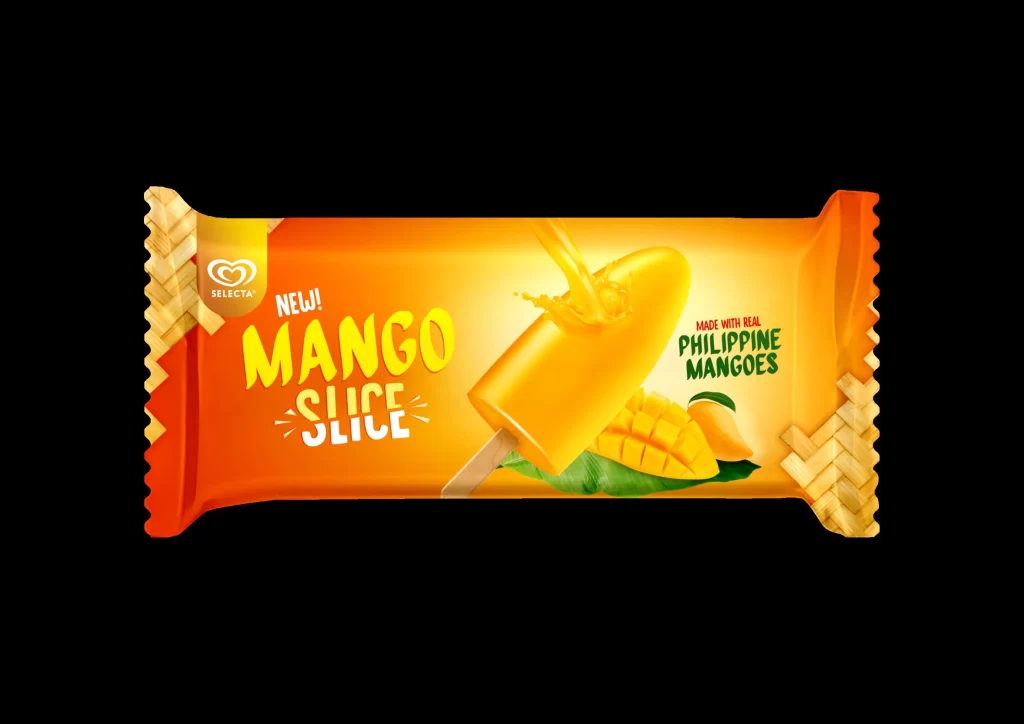
Vibrant orange and yellow gradients saturate the Selecta Mango Slice wrapper, which features crimped edges mimicking woven wicker texture on both ends. Bold, playful typography spells out 'NEW! MANGO SLICE' in a sunny yellow-to-white gradient, while the right side carries green text confirming it is made with real Philippine mangoes. A glossy popsicle with juice splashing off its surface sits atop sliced fruit and leaves, all illuminated by warm studio lighting that makes the colors pop against the deep black void surrounding the package.
What sets this particular design apart is its clever use of tactile visual cues that suggest tropical authenticity without relying solely on photography. The basket-weave pattern at the seal points creates an immediate association with traditional Filipino craftsmanship, while the dynamic splash effect on the frozen treat conveys freshness and juiciness in a static format. Designers studying this piece will notice how the color progression from deep orange to bright yellow guides the eye naturally toward the product hero.
Food packaging students could analyze the typographic hierarchy here to understand how flavor claims are prioritized over origin stories in frozen dessert marketing. Brand identity teams working on tropical product lines might study the balance between photographic realism and graphic pattern elements to achieve similar appetizing results. Anyone needing to examine these specific material textures or color values can grab the full-resolution file for free directly from our asset library.