Martha Stewart Pets Treats Oatmeal Cookie Brown White Illustration
Topics
Details
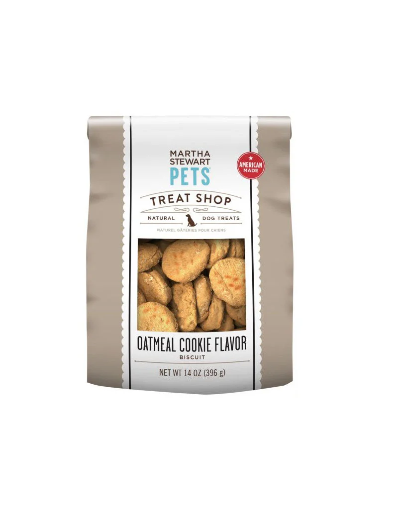
A fourteen-ounce bag of Martha Stewart Pets Treat Shop oatmeal cookie biscuits stands centered in the frame, its matte taupe body flanked by a white label with scalloped edges. The packaging displays the brand name in black and teal lettering above a red circular badge proclaiming American manufacture, while a rectangular window reveals the golden-brown, irregularly shaped treats inside. Soft, even lighting eliminates harsh shadows across the product, which sits against a clean, neutral backdrop that emphasizes the bag's vertical orientation and the crisp typography detailing the net weight of 396 grams.
Visual interest derives from the contrast between the earthy, understated tone of the bag's main material and the bright, decorative label that dominates the front face. The scalloped border adds a tactile, boutique quality that distinguishes this pet treat packaging from more utilitarian competitors, while the transparent window creates an immediate connection between the consumer and the actual product. Typography choices—ranging from the elegant serif used for the brand to the bold sans-serif announcing the flavor—establish a clear hierarchy that guides the eye from brand identity down to specific product details.
Packaging designers studying premium pet food branding would find value in analyzing how color palettes and ornamental borders communicate quality without excessive ornamentation. Marketing teams developing natural or artisanal product lines could examine the balance between photographic transparency and graphic elements to build consumer trust. Retail merchandisers might reference the composition when planning shelf layouts that require products to read clearly from a distance while maintaining an upscale aesthetic.