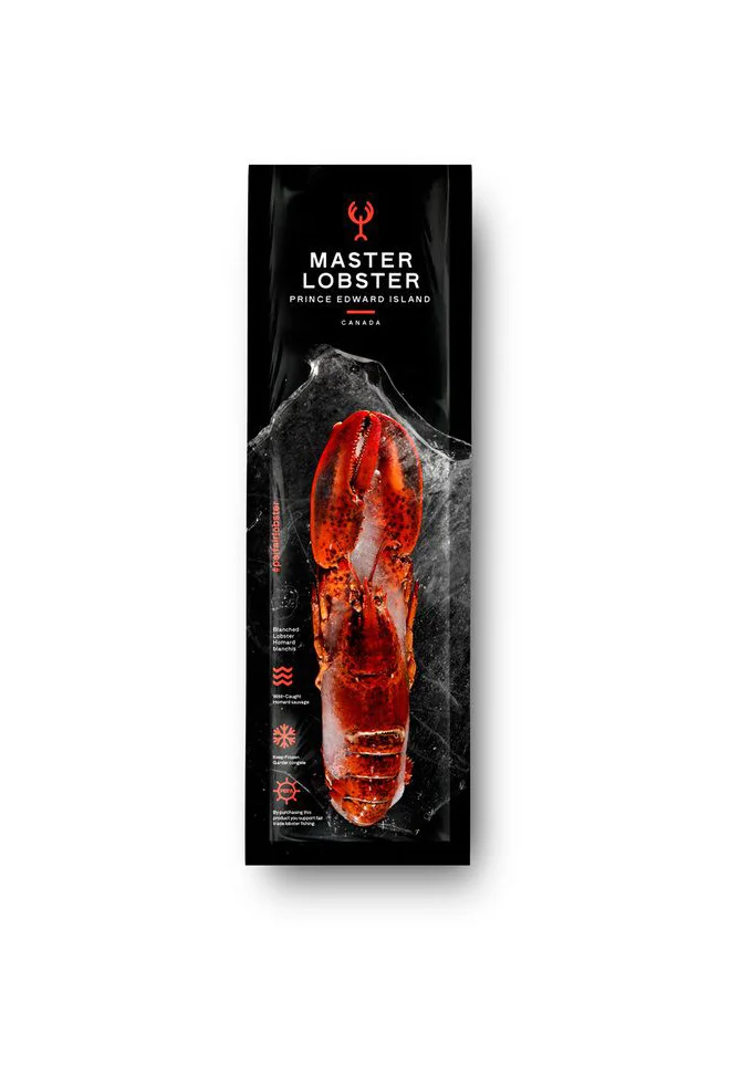
Master Lobster Canada Lobster Tail Pouch Packaging
Topics
Details
A vertical black plastic pouch displays a vivid red lobster tail centered against a translucent, ice-crystal texture that fades into darkness. White sans-serif typography spells out ‘MASTER LOBSTER’ above ‘PRINCE EDWARD ISLAND’ and ‘CANADA’, while a red trident emblem anchors the upper portion. The crustacean’s glossy shell catches light from the front, revealing segmented anatomy and subtle orange highlights along its curved form.
High-contrast color dynamics between the crimson seafood and obsidian packaging create immediate visual hierarchy, drawing the eye to the product through value rather than size. Vertical orientation and asymmetrical text placement break conventional food-label grids, establishing a premium aesthetic that balances clinical precision with organic texture. Iconography on the left margin—wavy lines, snowflakes, and sun symbols—communicates handling instructions without cluttering the primary visual field.
Brand strategists developing luxury frozen-goods identities could analyze this composition for balancing nutritional information with hero imagery. Packaging engineers might study how the crystalline overlay suggests temperature control without literal thermographic elements. Art directors photographing shellfish for e-commerce catalogs would benefit from examining how frontal lighting emphasizes shell gloss while maintaining legible surface detail beneath transparent materials.